VA-11 HALL-A fucking rocks, try it
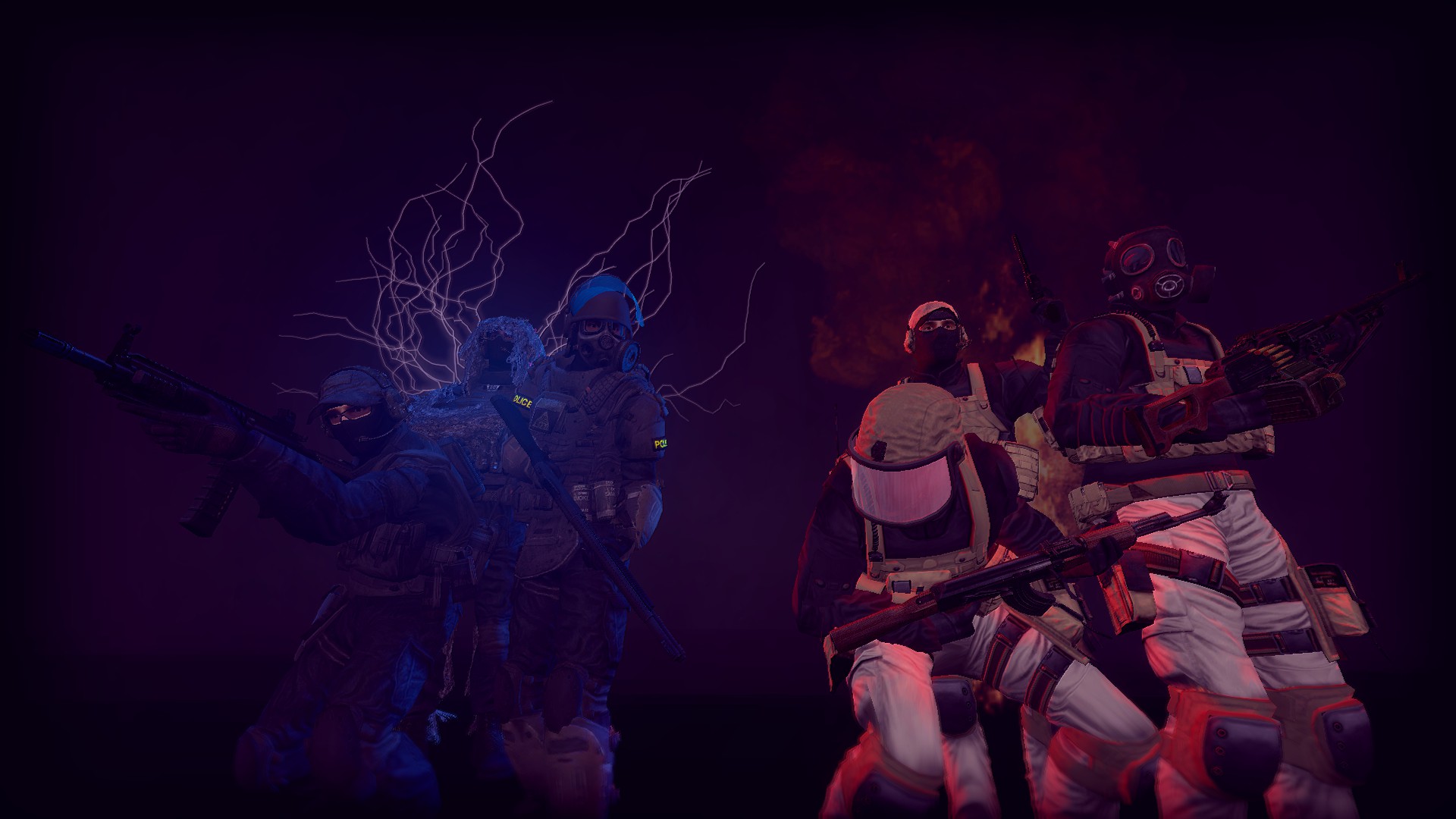
@Reinhart, gotta admit, I like when people don't focus only on one character, but actually on a whole scene. Lots of neat details, nice little atmosphere, but also there's the whole problem with details you didn't fix. Stuff like
this,
this,
that, or
those just throws me off, really. Same goes for the overuse of blur, which is a trademark of
@spectry, it's just painful to look at it because of how much you've put it onto it. Still, damn cool pose, and definitely took you loads of time. I like how the scene is actually open, with stuff not being fully shown, but rather cut by the edges of the photo, which kinda points at it all being just a part of something bigger. Nice thing, keep it up, proud of you
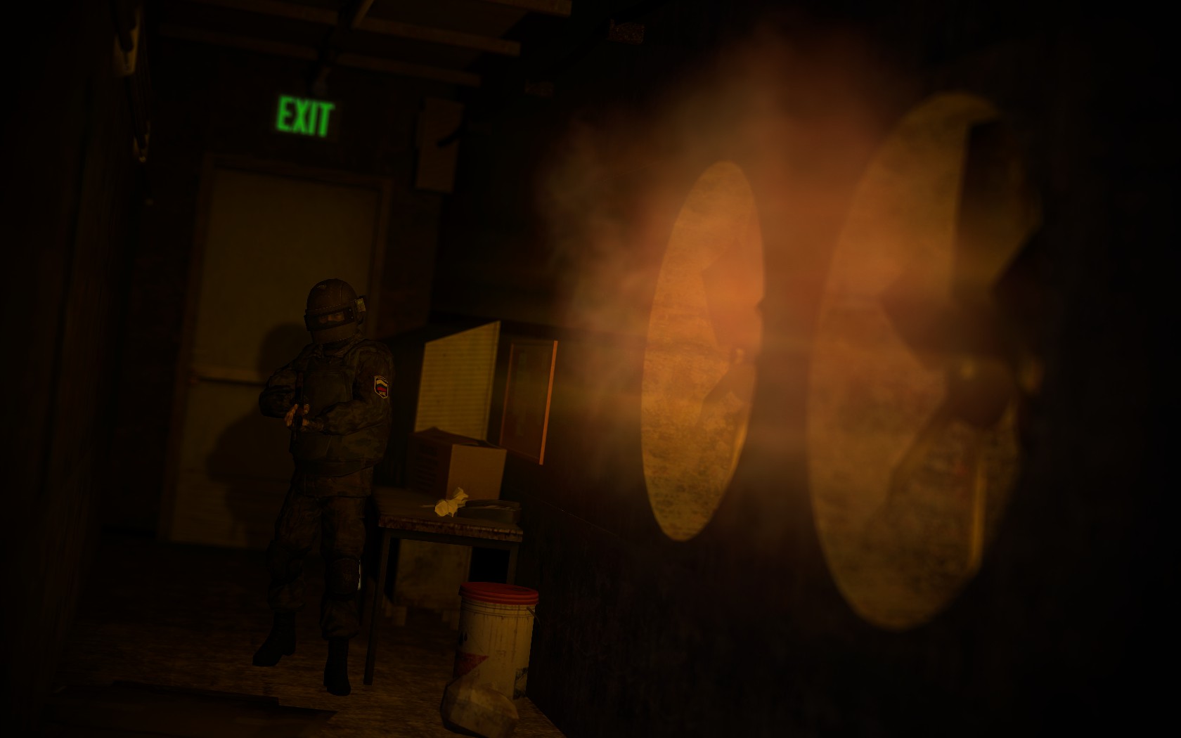
@afran, you'll always be a dev in my heart. And so, like a dev you did something magnificent, that I now use as one of the screens in Gmod menu. Absolutely gorgeous climate, even when not that much is going on, but since you were The Man quite a bunch of times, I'll push you out a bit, so others have a chance, ye?
@Dindex, I'd say that it's an interesting, and rare concept, but also can easily be boring. Little of action in a place like bar, or just a shop is something common, that's why you should've squeezed as much juice out of it as possible. You could do that by pretty much putting many people talking about different things, maybe some bar fight in the background, myabe someone hitting up to a girl, just go creative. Btw, I get that it's gunsmith, but you know, lots of stuff could be happening. I'll take it that you already know that the closed eyelid isn't exactly a great thing, plus that the camera angle could be closer to what they have in the movies, or just generally using The Rule of Thirds would fix it. Is ok
@Elan, another
to your colelction. It's actually pretty cool, just could use more stuff, maybe a second layer of ground in the background, with a house there. I'll link it to my firend, as she like this type of wallpapers, good work fam
@Erkor, they should hire you at Blizzard,
x3
@Calamari,
judging the first one. I actually like how cliche, yet original it is. There's some style to it, like half neon, half classic. I admire the colour play there, and the posing is pretty dynamic, but the camera angle is really iffy. I'd really aim for something like
this. Still, cool thing, even if you could pump the resolution up a bit. Looking forward to future submissions fam
@LykosNychi, while I wouldn't necessarily classify it as art, it's a pretty damn original thing to see here. Not really a thing for this type of competition, but hey man, it's a great fucking thing to finally see something new here, trust me. After all those crappy poses that don't follow my advices that I already posted about fifty times, it's refreshing to see (or rather /hear/) something like this.
, keep it up fam, for whatever server you're doing it, just keep pumping that shit out
@Hydralisk, tbf, it's all good; it has a neat climate, some okay particles, acceptable posing and a tense concept. However, like in many other poses, the camera work is really far behind rest of it all. Pretty much what I'd do here, would be (again) going with The Rule of Thrids, and putting him on the left side of it, as well as zooming in at least three times. Maybe some light volumetrics coming from the vents as well, preferably on him, so there'd be some interesting shadow play. That would also fix the problem of empty space, especially if the camera would be at about 40 degrees from the line of sigh f the guy, aiming mostly at the vents, rather than the gy himself. It's cool, worth a remake, and then, maybe, a wallpaper
@Club Ace, I see what you did there. Indeed, a neat concept, that I actually interpreted some other way before you explained it, but my thought of it was actually pretty close. I like the reflection thing, which is definitely a plus, however you added a bit too much of the light bloom, plus it's actually going through thevisior lid,
here. While I like when people play with colours, it's usually way better if you actually do some major things like this along with changing a whole color set of the photo.
Here's my idea of it. Idk, low res because cba, but looks better for me, even if I did go bit overboard with the editing. There's also the empty space in the background, but you already know that. Camera angle is decent though, a nice change, and so is the posing.
bla bla
Finally @Anleas and @spectry, who gets a temp ban
for being too good
that's what I was talking about boy
smaller win, but still win, @dee pixel, and his really
atmospheric pose