Goonsworthy
Whatever happens, happens.
- Joined
- Oct 11, 2016
- Messages
- 2,052
- Nebulae
- 1,644

Well it was meant to be CM my initials but someone else was CMwhat's CML
charlie makintoshWell it was meant to be CM my initials but someone else was CM
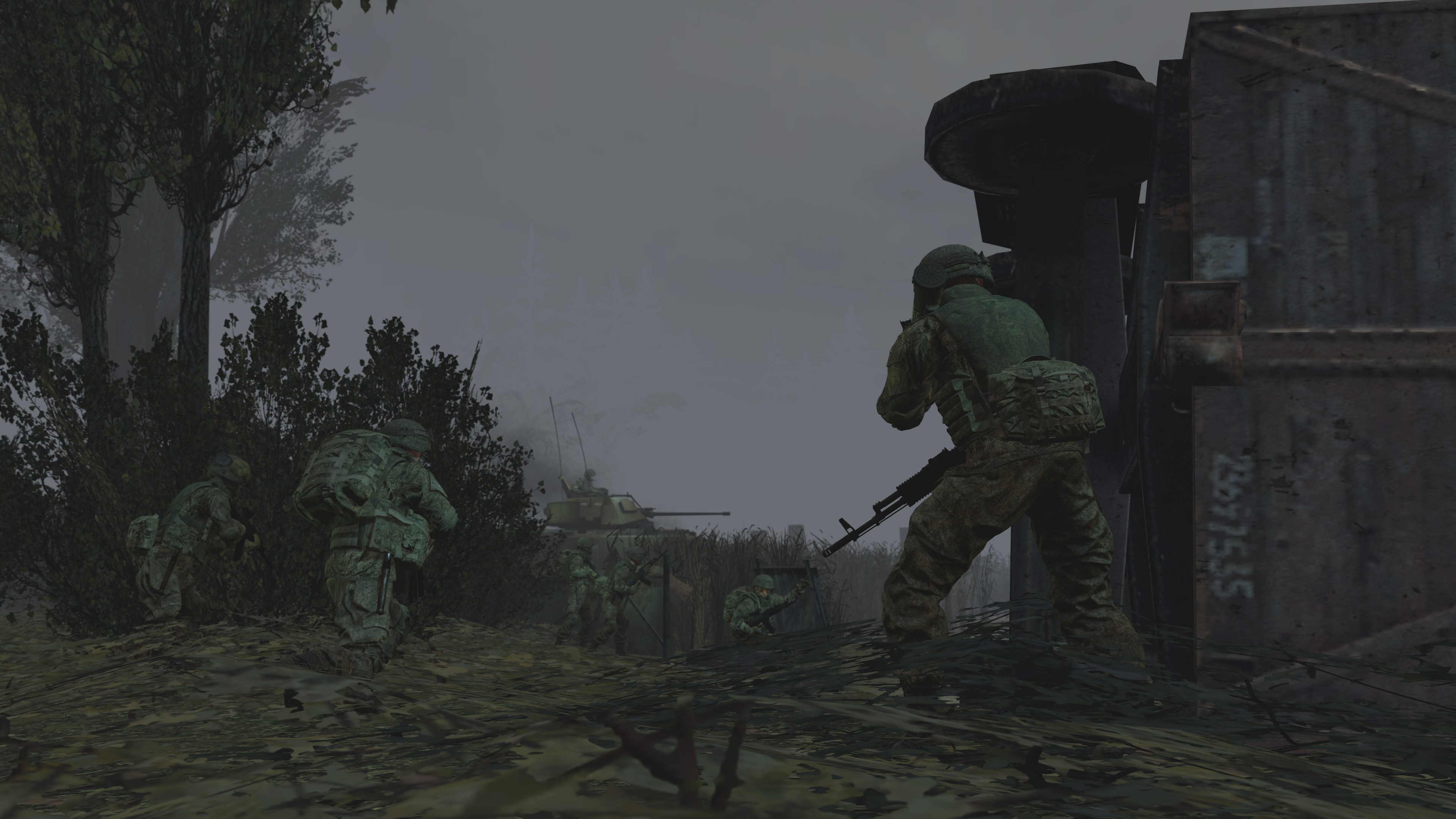
Why you always gotta post so many GOOD pictures man, you're only supposed to submit ONE THING god damn it. I took my favourite from the bunch and we're gonna work with that. First off, great posing on each of the models. It all looks fantastic and natural with the addition of lighting and fade to fog. If anything were missing, in my honest opinion. Some depth of field on the leaves at the bottom of the picture before it reaches the soldiers, and perhaps a little post edit rain couldn't have hurt? So yeah the main take away here is that everything you do is great, just needs that post process make over sometimes to get that next level. Love it.
Much like Dudu, I'm only gonna critique the (imo) best one. And after a good two minutes I deliberated that the debris was not added in post, but in fact just so well lighted and coloured that I was convinced it was real. The lighting here is op as hell, much like dudu it's super natural and hasn't got any harsh shading which is something I'd personally always be sure to use. This has changed my mind. The composition and camera angle is great as well with the kind of transitional movement from stood still to running with the RPG guy, and the man with the AK bobbing for a good angle... just great and natural looking. If I could change ANYTHING, woulda been the skybox. Aside from that it's class. Great work.
I love these niche little environments you tend to make as of late. And this is another great example to those collections. But as usual, I have some obnoxious remarks that make it sound like I know what I'm doing but you've made these more than me probably; the scale of things my guy. Like, it's amongst a load of trees right and the vines and ropes on the main thing looks GREAT. But then all the blurred out stuff in the back looks huuuuuuuuge. The lighting is mega on key here though. No complains with that. Keep up the good work :^).
When I open the image in a new tab, and zoom in. Then this picture is fantastic, and easily one of the most in depth scene-builds of the week but do you wanna know what let you down? This gosh darn camera angle and how zoomed out it is. Not to mention the lighting being quite difficult. I did not even realise the duo of droids on the tank in the middle till a minute or two went by. Think of the angles please, and save this scene build! It's great!
Great pose, great reference, but I do not agree with the lighting with my whole heart. It's a nice battlefield kinda glow and I think it would've looked better if the blue was darker personally. Great portrait pic here though.
A.O.T.W S2, W25 (21.10.2019)
Quit my job ✔
Got a new job ✔
Finished a poster ✔
Finished ANOTHER poster ✔
Finished part 1 of an assignment at uni ✔
Prepared for the next week of uni work and presentations ✔
Halloween party outfit sorted ✔
AOTW Review ✗
LETS GOOOOO
Why you always gotta post so many GOOD pictures man, you're only supposed to submit ONE THING god damn it. I took my favourite from the bunch and we're gonna work with that. First off, great posing on each of the models. It all looks fantastic and natural with the addition of lighting and fade to fog. If anything were missing, in my honest opinion. Some depth of field on the leaves at the bottom of the picture before it reaches the soldiers, and perhaps a little post edit rain couldn't have hurt? So yeah the main take away here is that everything you do is great, just needs that post process make over sometimes to get that next level. Love it.
Much like Dudu, I'm only gonna critique the (imo) best one. And after a good two minutes I deliberated that the debris was not added in post, but in fact just so well lighted and coloured that I was convinced it was real. The lighting here is op as hell, much like dudu it's super natural and hasn't got any harsh shading which is something I'd personally always be sure to use. This has changed my mind. The composition and camera angle is great as well with the kind of transitional movement from stood still to running with the RPG guy, and the man with the AK bobbing for a good angle... just great and natural looking. If I could change ANYTHING, woulda been the skybox. Aside from that it's class. Great work.
Cheeky editorial initials for school huh? C for cinema, M for music.. L for....................................... idk.
Composition of it all is great though, especially like how the beatles and j-division meet the top of the radiohead album at the same place. And the subtle beat of colours going through don't make it disorientating either which a lot of mashups tend to. BUT to really make these things clean, I'd often suggest an outline to go around each letter, like a black border or something. Nice work Commander.
I love these niche little environments you tend to make as of late. And this is another great example to those collections. But as usual, I have some obnoxious remarks that make it sound like I know what I'm doing but you've made these more than me probably; the scale of things my guy. Like, it's amongst a load of trees right and the vines and ropes on the main thing looks GREAT. But then all the blurred out stuff in the back looks huuuuuuuuge. The lighting is mega on key here though. No complains with that. Keep up the good work :^).
When I open the image in a new tab, and zoom in. Then this picture is fantastic, and easily one of the most in depth scene-builds of the week but do you wanna know what let you down? This gosh darn camera angle and how zoomed out it is. Not to mention the lighting being quite difficult. I did not even realise the duo of droids on the tank in the middle till a minute or two went by. Think of the angles please, and save this scene build! It's great!
Great pose, great reference, but I do not agree with the lighting with my whole heart. It's a nice battlefield kinda glow and I think it would've looked better if the blue was darker personally. Great portrait pic here though.
MY WINNING VOTE: @Dudu Fadende
-
what a damned mess we're making of things...
Another week goes by.
Reminder that there are four judges.
Hope I was useful for you guys or picked something up.
Will post the Halloween competition thread later on.
Hope people actually play cus I don't want the money I set aside to go to waste.
Or else it will fuel my bad habits.
TTYL.
- Daniel.
One of my friends actually pointed it out to me the C for cinema, M for music and L for literature. The CML actually stands for Conor McLoughlinCheeky editorial initials for school huh? C for cinema, M for music.. L for....................................... idk.
Composition of it all is great though, especially like how the beatles and j-division meet the top of the radiohead album at the same place. And the subtle beat of colours going through don't make it disorientating either which a lot of mashups tend to. BUT to really make these things clean, I'd often suggest an outline to go around each letter, like a black border or something. Nice work Commander.
tried making the lighting look like when they were in the carbonite chamberGreat pose, great reference, but I do not agree with the lighting with my whole heart. It's a nice battlefield kinda glow and I think it would've looked better if the blue was darker personally. Great portrait pic here though.
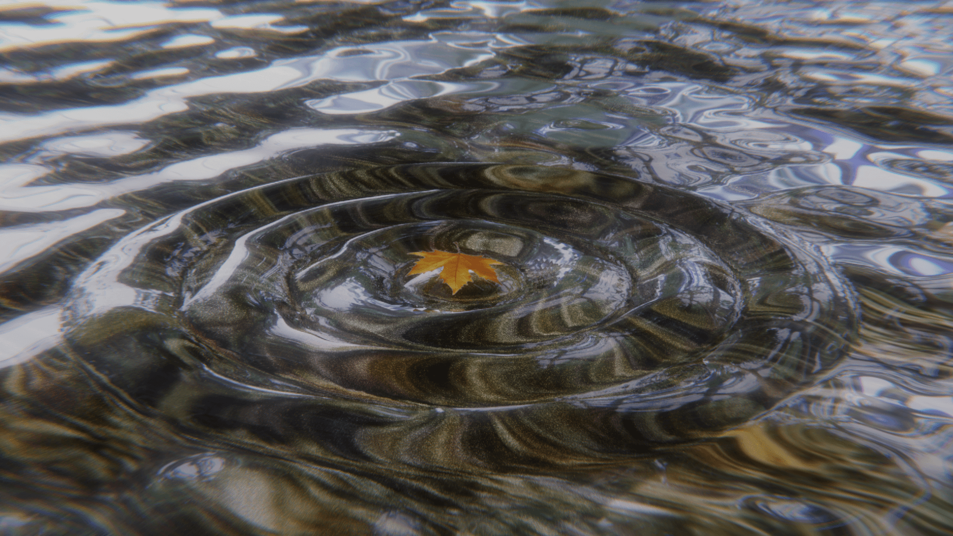
rings are thicc
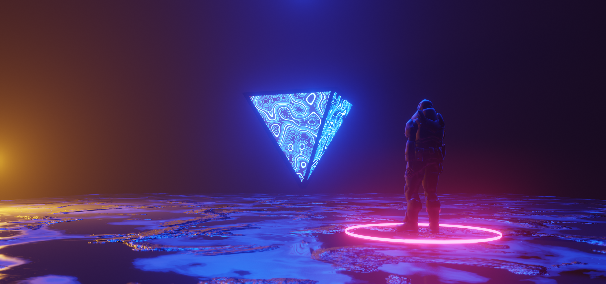
i made this an hour or so in blender, some criticism would be nice as this is my first scenebuild, kind of