Goonsworthy
Whatever happens, happens.
- Joined
- Oct 11, 2016
- Messages
- 2,052
- Nebulae
- 1,644
The dune sea my dudeTatooine has two suns, and is more rocky overall compared to just sand.
:wink:

The dune sea my dudeTatooine has two suns, and is more rocky overall compared to just sand.
:wink:


However, I see more issue in few others. First off, the fog thing is a nice way to both add climate and to hide those bad, little problems, but you covered the crow with it as well, crow, that should be sitting close to the viewer, thus not being effected by it. Another one is the lack of shadows, or even tiny pieces of it on things like the guy working in the bottom left corner, or... These things.The castle seems as big as a mountain.
The castle's gates look out of place.
Perhaps add a path towards the castle's gate.
cheers blad, i'll be making a new one soonFucking hell, back to it again
@Eddard Stark, as you said, it's pretty simple: one model, one light, and that's all. Not much to say, other than what Xenzie said about rim lighting, or generally adding some interesting lighting. I'd still refer to the Xenzie's guid, as it covers poses like this pretty well
@$Vex$, first thing that I could see, was that transparent eye. SFM likes to do that with some models, and here's how to fix it. Other than that, you could move the camera bit to the left, as the far right of the poster is completly unused, while taking about 1/4 of the screen. I also don't really get it's concept, if it's supposed to be a reference to something in Dark Souls, then fuck me, I need to finally play it over. It's a pretty dull pose, I don't feel any tensity, no emotions, no message, nothing, really. It's mainly the concept's fault imo, but then again it might be some spicy reference that I don't get. Idk, it looks more like a screenshot, rather than a proper poster. Still, we all started like that, and just the fact that you aren't one of those pussies that fear of using SFM gives me the right to believe in your future. Train hard fam, you'll get there one day
@lesbian sausage, was this image rendered by a calculator
Really, this resolution is just slightly bigger than my phone, how do you play with that? Right, either way, it's pretty empty, with props being visibly there as props, and not as a part of environment, while light is clearly casting only on that guy there, and with an immense power, blinding him probably. It was a try, as you said, but that doesn't mean that it's trash. It's concept is like in one of those FPS game covers, which I didn't see lately and are generally a good bet, as they simply look good. Spend some time, a pose doesn't need to be done in fifteen minutes, it shouldn't even. Good luck mang
@Clark, honestly, it'd be golden if not the lack of HDR lighting on the map and lack of interesting editing. You could also fill up the scene with few people corssing by, trading drugs, or whatever, but it's generally ok
@Scone !,
This is the definition of depression
It seems to be rushed in my eyes, without any detailed drawing, nor anything being there, not even a single rock. It's also bit weird that those sand dunes there are so packed together and that there's so many of them
@Elan, while there's tons of work put into it, the lack of time for polishing the details threw me off. At first glance, it's a pretty good poster. After you dig into it however, there are tons of those little, itchy things that make you say "no" to this one. @medley covered most:
However, I see more issue in few others. First off, the fog thing is a nice way to both add climate and to hide those bad, little problems, but you covered the crow with it as well, crow, that should be sitting close to the viewer, thus not being effected by it. Another one is the lack of shadows, or even tiny pieces of it on things like the guy working in the bottom left corner, or... These things.
While those things look ugly, the way you cut the guy, or the little town out of the original picture is pretty well done, and I wouldn't have noticed it missing if not for the link you added there. As you said, you kind of gave up in the middle of it, which shows off clearly, but it's not terrible either. Better than my photoshop work anyway
Now, the big two
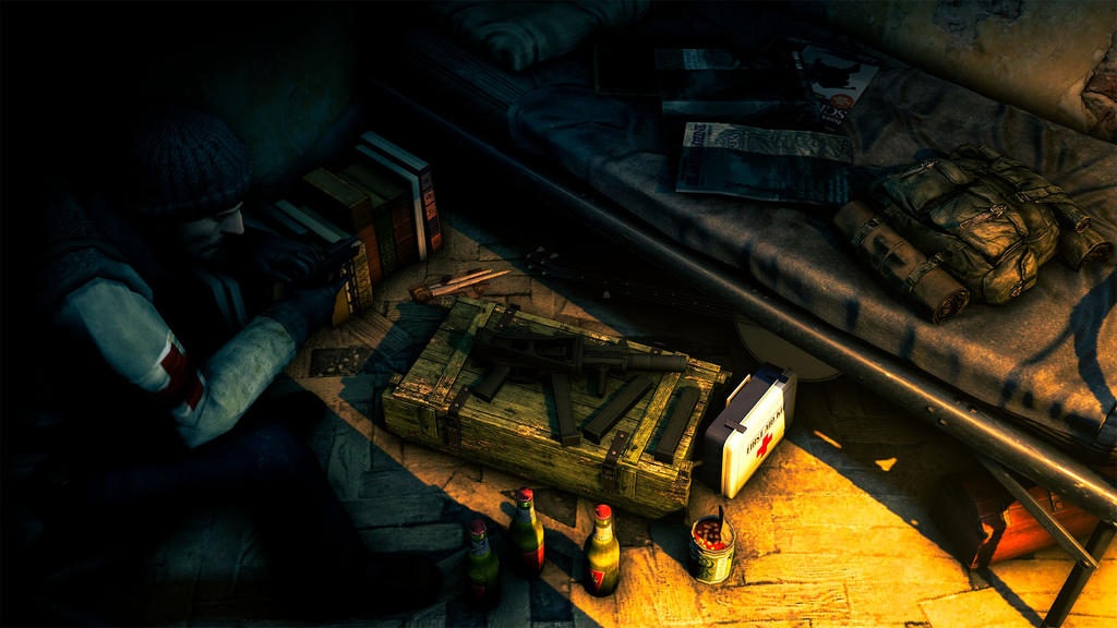
@MaXenzie, I talked to you about it through steam, and I told you what's wrong with it: lack of shadow of that shotgun there (it's even inside the ground tbf), tons of those filthy grains all over the poster, and that guy on left, yeah... I know what you were going for, but it'd be safer to just lie him down the floor, instead of going for this completly unnatural pose. His hips and neck are broken, his arm looks like it's leaning onto the ground, but it's fingers say otherwise. However, the guy in the middle is avatar worthy, really, that's some quality right there. You've also used them lights perfects, but I suppose that's stating the obvious now
Still, I'm choosing @Danny over this, as his thing, is taken straight from some comic to say the least. Only problem with it is the low resolution, but it's not /that/ terrible either, just too bad that it can't be a wallpaper.
Your duel ends with Danny doing a juicy K.O.
However, despite all that, I've decided to give this shitty medal to @b00ty_Senpai, as his pose has tensity, some story (zombies behind their legs, they all look as if they'd be walking around for few days at least, while being some tactical team or smth) and quality models and effects. It's not stunning, but as for a guy that isn't a media dev, or some other faggot like it, I couldn't resist and give you a big one.
tons of those filthy grains all over the poster
His poses have a reason for that tho, as they're usually from POV of a CCTV, or other device alike, while here it feels forcedFucking George taught me that.
tnb models are the definition of how to be a good roleplayer
Also for my resolution problem the only war I capture my stuff is by steam screenshotting it then gyazo'ing it, so it's pretty compressed but good quality.Fucking hell, back to it again
@Eddard Stark, as you said, it's pretty simple: one model, one light, and that's all. Not much to say, other than what Xenzie said about rim lighting, or generally adding some interesting lighting. I'd still refer to the Xenzie's guid, as it covers poses like this pretty well
@$Vex$, first thing that I could see, was that transparent eye. SFM likes to do that with some models, and here's how to fix it. Other than that, you could move the camera bit to the left, as the far right of the poster is completly unused, while taking about 1/4 of the screen. I also don't really get it's concept, if it's supposed to be a reference to something in Dark Souls, then fuck me, I need to finally play it over. It's a pretty dull pose, I don't feel any tensity, no emotions, no message, nothing, really. It's mainly the concept's fault imo, but then again it might be some spicy reference that I don't get. Idk, it looks more like a screenshot, rather than a proper poster. Still, we all started like that, and just the fact that you aren't one of those pussies that fear of using SFM gives me the right to believe in your future. Train hard fam, you'll get there one day
@lesbian sausage, was this image rendered by a calculator
Really, this resolution is just slightly bigger than my phone, how do you play with that? Right, either way, it's pretty empty, with props being visibly there as props, and not as a part of environment, while light is clearly casting only on that guy there, and with an immense power, blinding him probably. It was a try, as you said, but that doesn't mean that it's trash. It's concept is like in one of those FPS game covers, which I didn't see lately and are generally a good bet, as they simply look good. Spend some time, a pose doesn't need to be done in fifteen minutes, it shouldn't even. Good luck mang
@Clark, honestly, it'd be golden if not the lack of HDR lighting on the map and lack of interesting editing. You could also fill up the scene with few people corssing by, trading drugs, or whatever, but it's generally ok
@Scone !,
This is the definition of depression
It seems to be rushed in my eyes, without any detailed drawing, nor anything being there, not even a single rock. It's also bit weird that those sand dunes there are so packed together and that there's so many of them
@Elan, while there's tons of work put into it, the lack of time for polishing the details threw me off. At first glance, it's a pretty good poster. After you dig into it however, there are tons of those little, itchy things that make you say "no" to this one. @medley covered most:
However, I see more issue in few others. First off, the fog thing is a nice way to both add climate and to hide those bad, little problems, but you covered the crow with it as well, crow, that should be sitting close to the viewer, thus not being effected by it. Another one is the lack of shadows, or even tiny pieces of it on things like the guy working in the bottom left corner, or... These things.
While those things look ugly, the way you cut the guy, or the little town out of the original picture is pretty well done, and I wouldn't have noticed it missing if not for the link you added there. As you said, you kind of gave up in the middle of it, which shows off clearly, but it's not terrible either. Better than my photoshop work anyway
Now, the big two
@MaXenzie, I talked to you about it through steam, and I told you what's wrong with it: lack of shadow of that shotgun there (it's even inside the ground tbf), tons of those filthy grains all over the poster, and that guy on left, yeah... I know what you were going for, but it'd be safer to just lie him down the floor, instead of going for this completly unnatural pose. His hips and neck are broken, his arm looks like it's leaning onto the ground, but it's fingers say otherwise. However, the guy in the middle is avatar worthy, really, that's some quality right there. You've also used them lights perfectly, but I suppose that's stating the obvious now
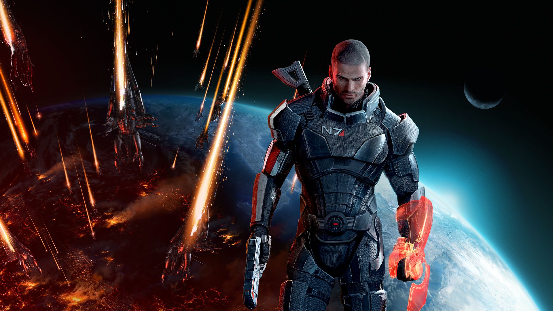
Still, I'm choosing @Danny over this, as his thing, is taken straight from some comic to say the least. Only problem with it is the low resolution, but it's not /that/ terrible either, just too bad that it can't be a wallpaper.
Your duel ends with Danny doing a juicy K.O.
However, despite all that, I've decided to give this shitty medal to @b00ty_Senpai, as his pose has tensity, some story (zombies behind their legs, they all look as if they'd be walking around for few days at least, while being some tactical team or smth) and quality models and effects. It's not stunning, but as for a guy that isn't a media dev, or some other faggot like it, I couldn't resist and give you a big one.