RGB
Proton
- Joined
- Nov 12, 2016
- Messages
- 234
- Nebulae
- 570
I hate all of you and as such my reviews shall appropriately match these feelings. I also do drawn art and not scenebuilds so results are obviously skewed to what I do. I focus on the bad over the good, if I do not point something out like posing or lighting it's because it was good.
@Cavity It's well-posed and uses interesting pieces, too bad the lighting is terrible and it looks like it was just slapped in, no colour correction, no post-processing seems to be present, and those are absolutely needed for posing art, it ends up looking really out of place. C-, good attempt, but very basic.
@Jer It's well-lit and that is my list of the good things. The problems here are that the posing is pretty poor and the broom goes on beyond its FEET even though it's off-screen, and you can just tell. Why would it ever hold a broom like that, there's nothing dynamic to suggest it should be holding it that way. No background. D-, can do better.
@Primer Screenshot or what? I don't know how to judge this, it looks like it's either a composited-in image or a still from a game or movie. In that regard it looks damn good, but the resolution is lacking and it's been done a thousand times before in high resolution. I could go on Elite: Dangerous and grab forty of these. What makes this one special? Nothing. Shoe me something special, give me a reason to actually think this is something special, because I'll say again, it looks good, but there is nothing here beyond the quick glance that makes it noteworthy. C+, derivative, nothing new at all, but I think you can do better.
@Eddard Stark See me after class.
@4lpha Very very simple stuff here, clearly playing with lighting. It's bare-basics but you're obviously working on what matters here for the future if you keep at it, and that will pay off. The scenebuild looks like crap, there's no post-processing. Neither are good, both are progression. C-, keep going and you'll get good.
@Tiger! I hate the coloured one. Like i actually hate it. I'm going to pretend it doesn't exist. This is actually pretty great here, using a biro to do a multi-shaded image can be a bitch to do well at times, as I know from experience, and you've gone and done something pretty good with it. I can tell what everything is, and despite the scratchy sketchy appearance it looks like a fairly solid design. B, I'd like to see a refined properly-done version of this.
@Heck I can't find much to say. I don't like it to start with, but that's me. The angle is good though, and so is the lighting, and these are major faults in most other people's work. The posing isn't bad either, nor is the scenebuild. Why don't I like it? I just don't, it doesn't sit well with me and my tastes, but it's good art. B-.
@Zombine It's well-designed, it's decently-posed, and colour-correction seems to have occurred, as well as post-processing. It looks good on a design level, but not on a presentation level, you know that. I like it, it's well-executed, but it's low-effort ultimately and it could be done better. C+, solid design but extremely easy to do.
@Fred Fire in lighting is always a tricky one, actually a difficult one, so when people always jump to it it looks bad. In this case it's lighting up the wrong parts of the body and you can see. The shadows are letting it down massively, as this is a perfect sort of opportunity to do cool stuff with long shadows cast out behind them, adjust contrast to darken the guys in the background so the foreground is the real focus. This is good, but it's not a completed effort. Seriously, take this back to the design stage and work on it and it'll be great. C+.
@spectry I'm doing these in chronological order and my first thought was "is this my winner this week?" . This shows just what a proper rendering engine can do, not Gmod. Lighting is great. Posing is great. Even the expression, which often looks so goofy in poses, is great. This is great. A if you made it yourself. F if it's a screenshot.
@Pale Rider I rate only one, and that's either the most progressed of a WIP or the first you submitted. We already talked about fire today anyway, so you can look to @Fred for that advice on why your second one is hot trash. Now, your main image is pretty... ehh... to put my first impression on you. You've done the expression decently, and the pose is getting there. I talk about lighting and colour-correction a lot though, because they really are essential. Post-processing this image would do wonders for it, but as it stands right now, D.
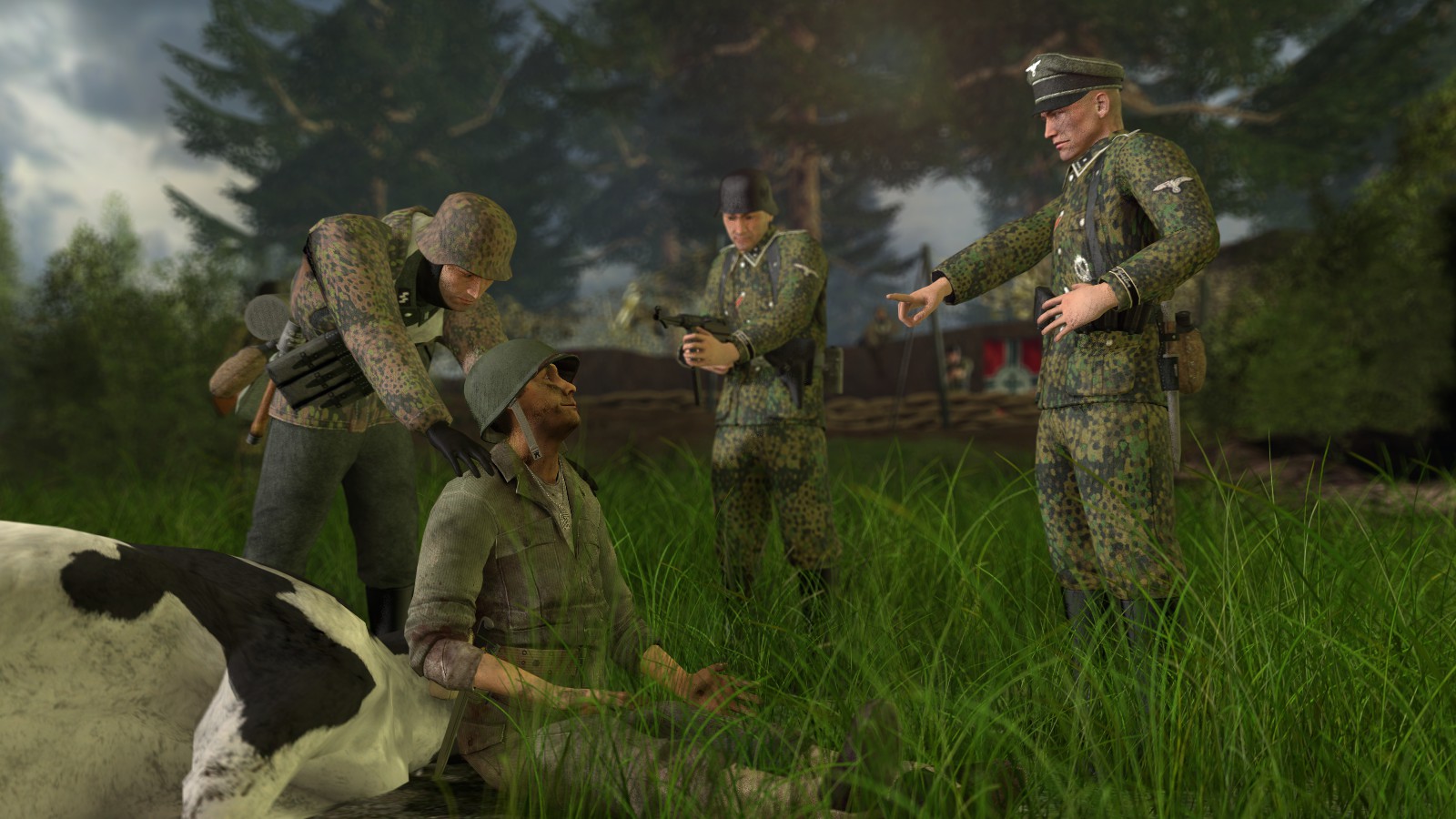
@Finlay3110 Sorry buddy
@Poxier I feel like I've reviewed this before. I like it though, a lot. Lighting, posing, expression, got it all, and you know everything you're doing to make it look good. There's a good contrast balance to keep it there, and all it can benefit from is better post-processing, A-.
@MaXenzie @dee pixel Goofy chains and goofy tools, it's the best-executed one here so that's why it's not the winner, because you know it's great. There's nothing I need to say really. A+.
@Heck Round two because I already reviewed you but then you did a better one. It's everything I said before but I love them both. The one with the shadows from the blinds most though. A.
@Raouldukejnr The review fatigue's set in, no food for minutes, no drink for-- okay, I have a drink. You've done something very simple and shit and processed the fuck out of it and now it looks good. That's what processing can do people. Contrast, depth of field, colour correction. B+.
@Andrew2 POV image, nice. You've got that down. Honestly I can't say anything about this beyond this is just like what I'd expect a game to actually look like. I moan about lighting a lot, Gmod has a bad lighting engine, you're gonna always get this from me. If the lighting was good this would be an A. Otherwise, B+.
@Aleks Taking the easy road out and saying it's solid. Takes advantage of the cartoonish style, vibrant colours, got an interesting angle and a dynamic pose. B.
@Trains Who wants to guess I'm about to moan about lighting? Well i won't, I think I've gotten the point across now, but it is still bad thanks to the Source engine. The poses themselves are stiff and kind of unnatural once you take a real look at them. Chests thrust out, twisted arms just to reach things, chins held too high and eyes all unblinking and terrified. That's what you should work on if you're doing more posing art. The poses themselves. Do everything you can to try make them look more natural. Even terrified people forced to take a photo wouldn't look like this. B- simply because working with this many ragdolls is so much effort and despite everything it does look good.
@Erkor Is it a screenshot? It looks good, it's a solid and simple design, but so many of these look like screenshots, and that's the biggest dealbreaker. it's incredibly simple, but if you did the editing for the portal it's good editing. If you didn't then I don't know if it was worth submitting. C+ if you did the editing, F if you didn't.
@Maxim Looks like Hide the Pain Harold, down to the eyes. Those soulless dead eyes. I can't unsee those eyes, they ruin the image. Make the glasses opaque because this could be decent if you do. D-.
@MutumbaZomba And sliding in with a last-minute entry is this guy. It's actually really good. I wish I wasn't worn down and sick of reviews because it's my second-favourite after we pretend that torture pic doesn't exist. I like the distortion, the editing, the angle, the pose, and the concept. Better facial expressions would make this fantastic. A-.
So now the winner, I already said who, I loved it, this one.

And to wrap up, a peek of one of the many things I've been working on as to why I've stopped submitting.

@Cavity It's well-posed and uses interesting pieces, too bad the lighting is terrible and it looks like it was just slapped in, no colour correction, no post-processing seems to be present, and those are absolutely needed for posing art, it ends up looking really out of place. C-, good attempt, but very basic.
@Jer It's well-lit and that is my list of the good things. The problems here are that the posing is pretty poor and the broom goes on beyond its FEET even though it's off-screen, and you can just tell. Why would it ever hold a broom like that, there's nothing dynamic to suggest it should be holding it that way. No background. D-, can do better.
@Primer Screenshot or what? I don't know how to judge this, it looks like it's either a composited-in image or a still from a game or movie. In that regard it looks damn good, but the resolution is lacking and it's been done a thousand times before in high resolution. I could go on Elite: Dangerous and grab forty of these. What makes this one special? Nothing. Shoe me something special, give me a reason to actually think this is something special, because I'll say again, it looks good, but there is nothing here beyond the quick glance that makes it noteworthy. C+, derivative, nothing new at all, but I think you can do better.
@Eddard Stark See me after class.
@4lpha Very very simple stuff here, clearly playing with lighting. It's bare-basics but you're obviously working on what matters here for the future if you keep at it, and that will pay off. The scenebuild looks like crap, there's no post-processing. Neither are good, both are progression. C-, keep going and you'll get good.
@Tiger! I hate the coloured one. Like i actually hate it. I'm going to pretend it doesn't exist. This is actually pretty great here, using a biro to do a multi-shaded image can be a bitch to do well at times, as I know from experience, and you've gone and done something pretty good with it. I can tell what everything is, and despite the scratchy sketchy appearance it looks like a fairly solid design. B, I'd like to see a refined properly-done version of this.
@Heck I can't find much to say. I don't like it to start with, but that's me. The angle is good though, and so is the lighting, and these are major faults in most other people's work. The posing isn't bad either, nor is the scenebuild. Why don't I like it? I just don't, it doesn't sit well with me and my tastes, but it's good art. B-.
@Zombine It's well-designed, it's decently-posed, and colour-correction seems to have occurred, as well as post-processing. It looks good on a design level, but not on a presentation level, you know that. I like it, it's well-executed, but it's low-effort ultimately and it could be done better. C+, solid design but extremely easy to do.
@Fred Fire in lighting is always a tricky one, actually a difficult one, so when people always jump to it it looks bad. In this case it's lighting up the wrong parts of the body and you can see. The shadows are letting it down massively, as this is a perfect sort of opportunity to do cool stuff with long shadows cast out behind them, adjust contrast to darken the guys in the background so the foreground is the real focus. This is good, but it's not a completed effort. Seriously, take this back to the design stage and work on it and it'll be great. C+.
@spectry I'm doing these in chronological order and my first thought was "is this my winner this week?" . This shows just what a proper rendering engine can do, not Gmod. Lighting is great. Posing is great. Even the expression, which often looks so goofy in poses, is great. This is great. A if you made it yourself. F if it's a screenshot.
@Pale Rider I rate only one, and that's either the most progressed of a WIP or the first you submitted. We already talked about fire today anyway, so you can look to @Fred for that advice on why your second one is hot trash. Now, your main image is pretty... ehh... to put my first impression on you. You've done the expression decently, and the pose is getting there. I talk about lighting and colour-correction a lot though, because they really are essential. Post-processing this image would do wonders for it, but as it stands right now, D.
@Finlay3110 Sorry buddy
@Poxier I feel like I've reviewed this before. I like it though, a lot. Lighting, posing, expression, got it all, and you know everything you're doing to make it look good. There's a good contrast balance to keep it there, and all it can benefit from is better post-processing, A-.
@MaXenzie @dee pixel Goofy chains and goofy tools, it's the best-executed one here so that's why it's not the winner, because you know it's great. There's nothing I need to say really. A+.
@Heck Round two because I already reviewed you but then you did a better one. It's everything I said before but I love them both. The one with the shadows from the blinds most though. A.
@Raouldukejnr The review fatigue's set in, no food for minutes, no drink for-- okay, I have a drink. You've done something very simple and shit and processed the fuck out of it and now it looks good. That's what processing can do people. Contrast, depth of field, colour correction. B+.
@Andrew2 POV image, nice. You've got that down. Honestly I can't say anything about this beyond this is just like what I'd expect a game to actually look like. I moan about lighting a lot, Gmod has a bad lighting engine, you're gonna always get this from me. If the lighting was good this would be an A. Otherwise, B+.
@Aleks Taking the easy road out and saying it's solid. Takes advantage of the cartoonish style, vibrant colours, got an interesting angle and a dynamic pose. B.
@Trains Who wants to guess I'm about to moan about lighting? Well i won't, I think I've gotten the point across now, but it is still bad thanks to the Source engine. The poses themselves are stiff and kind of unnatural once you take a real look at them. Chests thrust out, twisted arms just to reach things, chins held too high and eyes all unblinking and terrified. That's what you should work on if you're doing more posing art. The poses themselves. Do everything you can to try make them look more natural. Even terrified people forced to take a photo wouldn't look like this. B- simply because working with this many ragdolls is so much effort and despite everything it does look good.
@Erkor Is it a screenshot? It looks good, it's a solid and simple design, but so many of these look like screenshots, and that's the biggest dealbreaker. it's incredibly simple, but if you did the editing for the portal it's good editing. If you didn't then I don't know if it was worth submitting. C+ if you did the editing, F if you didn't.
@Maxim Looks like Hide the Pain Harold, down to the eyes. Those soulless dead eyes. I can't unsee those eyes, they ruin the image. Make the glasses opaque because this could be decent if you do. D-.
@MutumbaZomba And sliding in with a last-minute entry is this guy. It's actually really good. I wish I wasn't worn down and sick of reviews because it's my second-favourite after we pretend that torture pic doesn't exist. I like the distortion, the editing, the angle, the pose, and the concept. Better facial expressions would make this fantastic. A-.
So now the winner, I already said who, I loved it, this one.
And to wrap up, a peek of one of the many things I've been working on as to why I've stopped submitting.
Reactions:
List