Flanders
Atom
- Joined
- Apr 14, 2017
- Messages
- 3,727
- Nebulae
- 11,445
well shit i was going to post this week but looks like there's no chance at beating @Bobby Denton
Reactions:
List

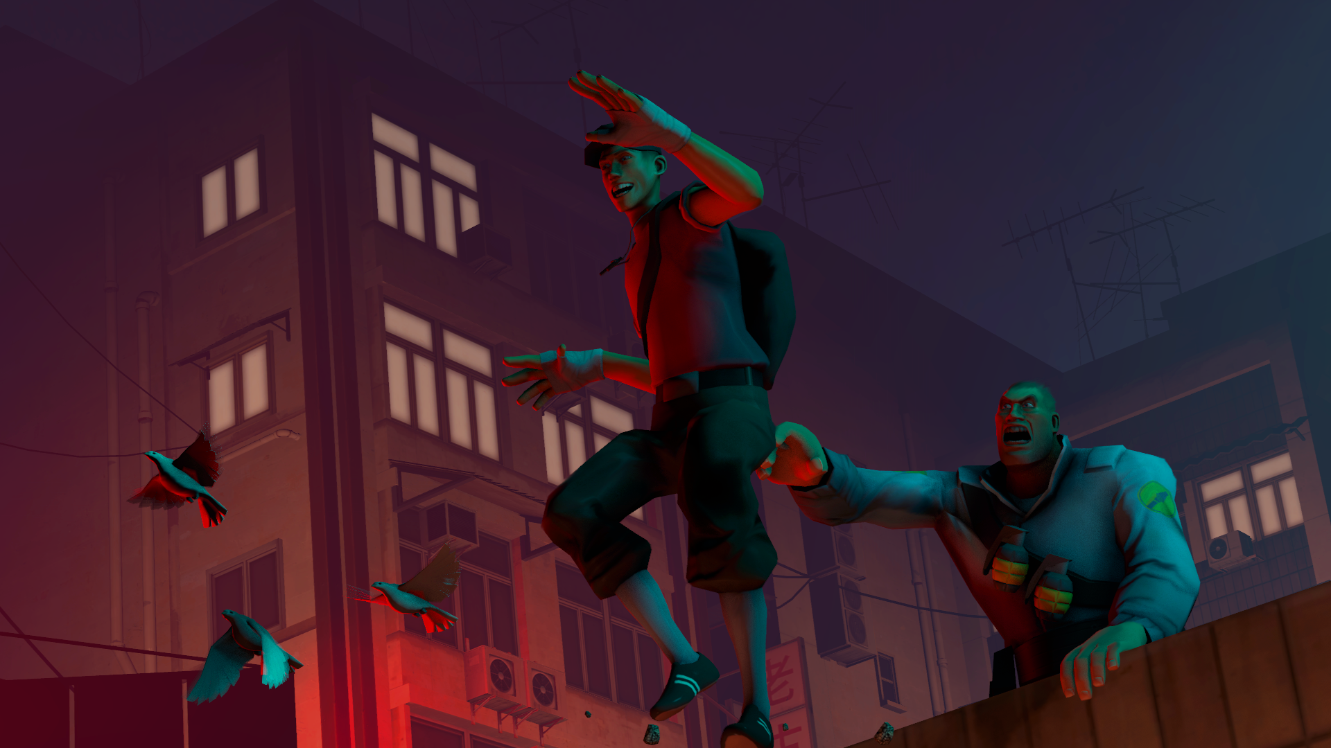
Now this is a sight to behold, a massive scale scene build with some pretty intricate detail and thought that seems to have gone into it. What's even more impressive is the style of lighting and how consistent shadows are with their locations. Nice stuff, only thing I'd make a comment on improving on is position dead bodies, unless that guy on the bottom left is faking it. Nice work.
Drawing isn't necessarily a talent of mine, though it does seem to be a growing talent of yours. And as much as a like this, I think you should try and expand this talent into drawing an actual scene, or motion, or something different that a character showcase. I am looking forward to the next one regardless, good stuff.
This is alright, maybe - just needs a bit more oomf somehow because it all looks really stiff. The lighting looks inaccurate too, shadow should be directly behind or more left at least. What I'm tryina to say is that this is all good and well, but the details need some more time spent on them for the nebulae win. Keep it up.
I haven't got much to add here, I like this style you do your drawing/outlines in - I have a quarrel with the choice of colour for the text though, I think maybe you should've gone for a white, with a purple outline. Just to match Jaina a bit more proudly. It's like matchin shoes with a belt mate it just makes things better. Nice work tho. Alliance ftw.
This ain't half bad, some good posing and positioning of the lighting. But I do think the lighting is what's letting you down regardless. In future, try to get a light behind the models as well as some kind of ambient lighting. If it's set down to a low brightness it just improves the realism of the picture and benefits in viewing. Just remember to turn the shadows off. Nice stuff.
Getting good vibes from that Payday 1 Mission on the bridge to extract that prisoner, superbly posed and well lightened as usual. But I think I've given you a win three times now. Keep it up cus you still good.
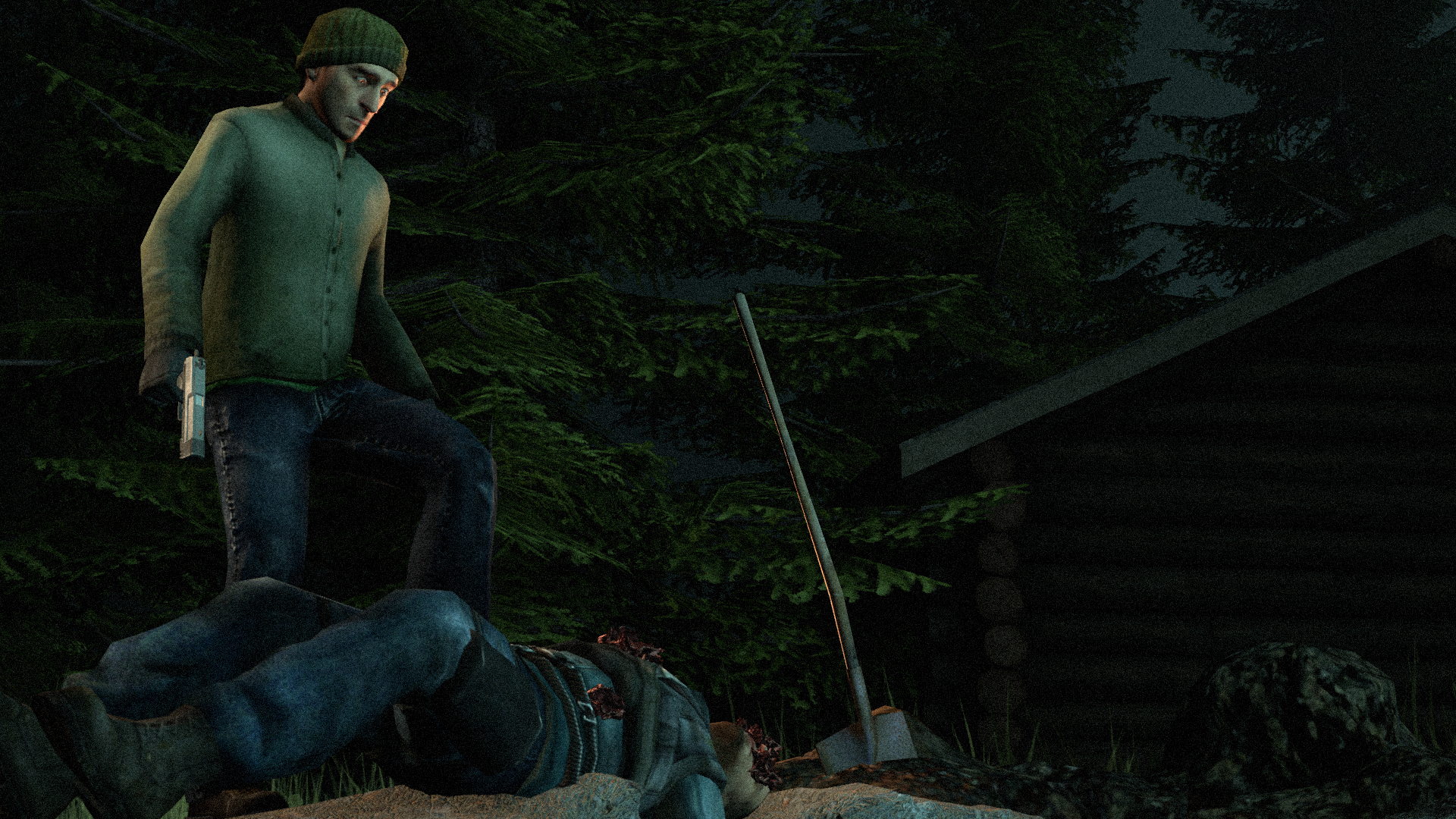
Well lit, well posed, shows some intimidation and fear even from outdated models.
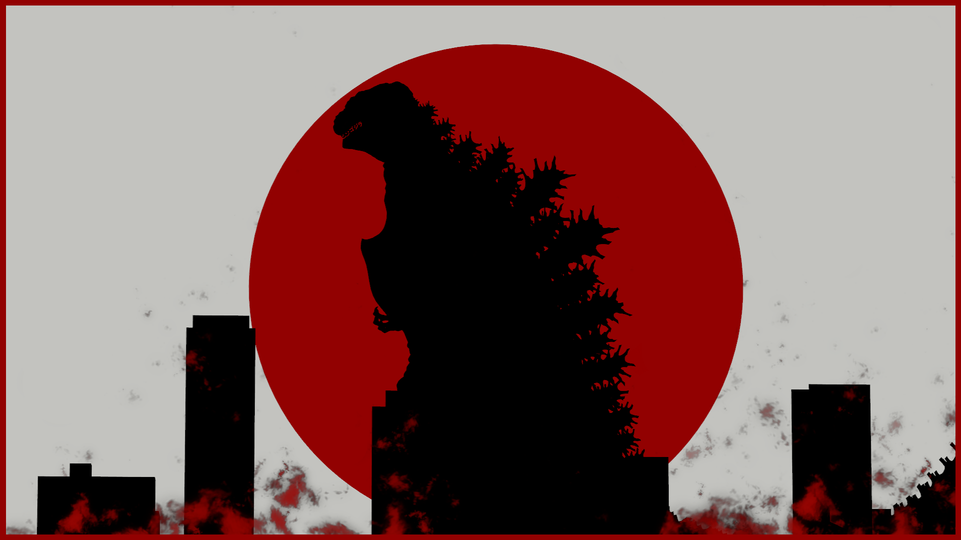
Needs some treatment in lighting brother, so dark. Not to mention that lack of buildings as well - Godzilla is all about over the top destruction so you gotta include a lot more fire than that, blokes huge. Try something like this again sometime because regardless of what I've said, I like it and you can only get better from it.

Now this is a sight to behold, a massive scale scene build with some pretty intricate detail and thought that seems to have gone into it. What's even more impressive is the style of lighting and how consistent shadows are with their locations. Nice stuff, only thing I'd make a comment on improving on is position dead bodies, unless that guy on the bottom left is faking it. Nice work.
holy shitback at it again with the school art shiz, this is a still from the movie stalker by andrei tarkovsky, made it from newspaper clippings
(incase your wondering, this was all glued onto an A1 piece of card)
This made me feel proudI haven't got much to add here, I like this style you do your drawing/outlines in - I have a quarrel with the choice of colour for the text though, I think maybe you should've gone for a white, with a purple outline. Just to match Jaina a bit more proudly. It's like matchin shoes with a belt mate it just makes things better. Nice work tho. Alliance ftw.
hahahaha, never done commisions, but id gladly post it to someone if they wanted itAlso, @Bobby Denton, holy fuck, sell that beauty to @Dallas and get me another one
Motivation back!