CloudBucket
Proton
- Joined
- Jun 3, 2017
- Messages
- 356
- Nebulae
- 723
Your image is compressed again, don't use imgur, it destroys image quality
what should i useImgur sucks ducks dude.

Your image is compressed again, don't use imgur, it destroys image quality
what should i useImgur sucks ducks dude.
Deviantart or Wduwantwhat should i use
updated!Deviantart or Wduwant
Imgur sadly now compresses no matter what you do, hence why i've had to stop using it
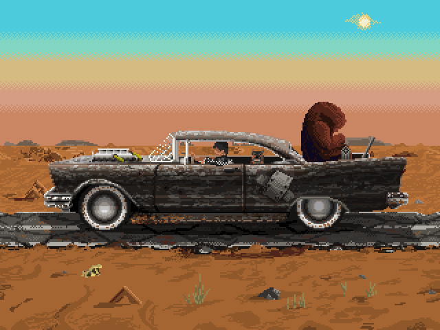
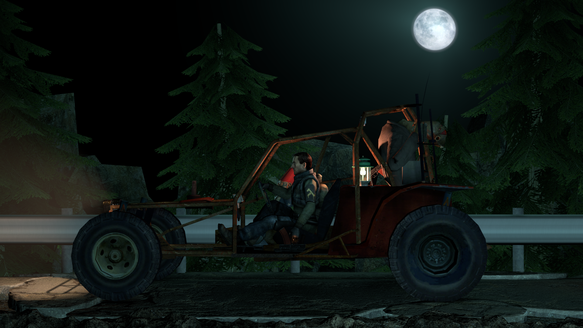
fallout 2Might be the wrong place but it'd be pretty epic if someone could try to recreate something like this in sfm/gmod, a packed car with a vort in the back and a rebel driving down a highway, probably nighttime. No particular reason I just like the aesthetic this gif gives
you got it G, gonna have a got at itMight be the wrong place but it'd be pretty epic if someone could try to recreate something like this in sfm/gmod, a packed car with a vort in the back and a rebel driving down a highway, probably nighttime. No particular reason I just like the aesthetic this gif gives
you're on a different realm of hell if you made thatHey, here's something I made.


Might be the wrong place but it'd be pretty epic if someone could try to recreate something like this in sfm/gmod, a packed car with a vort in the back and a rebel driving down a highway, probably nighttime. No particular reason I just like the aesthetic this gif gives

Might be the wrong place but it'd be pretty epic if someone could try to recreate something like this in sfm/gmod, a packed car with a vort in the back and a rebel driving down a highway, probably nighttime. No particular reason I just like the aesthetic this gif gives
@Lokinase, this one looks like a straight out teaser poster for some event, and by that, I mean both good and bad. You see, teasers don't really tell you much, but rather focus on displaying the atmosphere. Here, all I can see, is that it's some Union dirty business on the sea, with a really gritty aesthetic to it, enforced by some real nice editing. However, I don't really see the full context here, especially with a blank view of sea on my left, which imo could be enhanced with few other ships drifting on these stormy waves. Generally speaking though, it's interesting and definitely good, but it misses those few clues and additions to let me understand it fully. Either way though, I'm giving this one a

@egg,

@Lambda Coyote, plain and simple, this one doesn't bring too much attention, but I gotta admit, that's some nice lighting there. Not much is really present here, other than a character from Halo (ODST? Can't remember), looking up at something bright. If you'd move the camera further back and actually show us what's he's looking at, or at least some nice volumetric lighting from afar, that'd give you a fair amount of bonus points. I'd also reposition the camera for one other reason, as of right now, the background you're presenting is pretty much just dull blocks that together create something similar to a city of some sort, but I'm not sure. If you'd place the camera just in the right position (like here, here, or here) and added some eyecandies around, so that the background can be interesting as well, then this one would be some pretty neat looking poster. Wish you luck fam
@maga, just take a
@Piggo, you too,
@Dicknose, you made it pretty fast, but it's real nice either way. I know that this one isn't really a submission, but honestly speaking, if polished, this would make a great wallpaper. Just add some rotation movement blur to the wheels, maybe some particles floating around and a night sky, and you'd be good to go, really.


Thank ya, quote is supposed to be cringy. Almost a Kung Fury level of irony there. Thank you for the gold! I love both Zombine's and Constant's submissions, very good stuff.Sorry for not posing yesterday, but due to eating some of our superior Polish food mid writing this, I felt terribly sick yesterday. Here are the delayed results:
@Lokinase, this one looks like a straight out teaser poster for some event, and by that, I mean both good and bad. You see, teasers don't really tell you much, but rather focus on displaying the atmosphere. Here, all I can see, is that it's some Union dirty business on the sea, with a really gritty aesthetic to it, enforced by some real nice editing. However, I don't really see the full context here, especially with a blank view of sea on my left, which imo could be enhanced with few other ships drifting on these stormy waves. Generally speaking though, it's interesting and definitely good, but it misses those few clues and additions to let me understand it fully. Either way though, I'm giving this one a
@egg,
Add some lights bud
@Lambda Coyote, plain and simple, this one doesn't bring too much attention, but I gotta admit, that's some nice lighting there. Not much is really present here, other than a character from Halo (ODST? Can't remember), looking up at something bright. If you'd move the camera further back and actually show us what's he's looking at, or at least some nice volumetric lighting from afar, that'd give you a fair amount of bonus points. I'd also reposition the camera for one other reason, as of right now, the background you're presenting is pretty much just dull blocks that together create something similar to a city of some sort, but I'm not sure. If you'd place the camera just in the right position (like here, here, or here) and added some eyecandies around, so that the background can be interesting as well, then this one would be some pretty neat looking poster. Wish you luck fam
@maga, just take a
@Piggo, you too,
Maverick is a dumb operator, I want my man Mute to get a buff bigger than SMG-11
@Dicknose, you made it pretty fast, but it's real nice either way. I know that this one isn't really a submission, but honestly speaking, if polished, this would make a great wallpaper. Just add some rotation movement blur to the wheels, maybe some particles floating around and a night sky, and you'd be good to go, really.
So, the winner boys are:
@CloudBucket, the first
Not only was this one created from scratch, but it's also really well composed in terms of colors.
It has a really grim atmosphere, something of Fallout 1 combined with the editing of a neat looking movie.
I could whine about that quote being lil' cringy, but then again it actually tells us the story of this image,
and without it, it would turn out a bit more bland, so I'll let this one pass. Great job, so a goldie here, for you
@Zombine and @ConstantDisplay, the second
Both of these have incredible lighting, but in different way.
Zombine's photo has amazing colors, that are so surreal,
that I honestly wouldn't be surprised to see something similar in either a movie or a game.
As a side note, very nice, almost completely closed composition,
further reinforced by that dim lighting on the ground. Very nice one
ConstantDisplay's poster has purely outstanding shadows, and pretty much these alone,
so simple, yet so impressive, won this picture a honorary. That's what I'm thinking
when I say that lighting and shadows are very important.
@Lokinase, this one looks like a straight out teaser poster for some event, and by that, I mean both good and bad. You see, teasers don't really tell you much, but rather focus on displaying the atmosphere. Here, all I can see, is that it's some Union dirty business on the sea, with a really gritty aesthetic to it, enforced by some real nice editing. However, I don't really see the full context here, especially with a blank view of sea on my left, which imo could be enhanced with few other ships drifting on these stormy waves. Generally speaking though, it's interesting and definitely good, but it misses those few clues and additions to let me understand it fully. Either way though, I'm giving this one a