AOTW / WEEK 6/52 / 2020
no song this time bc I can't find one I like
lets go
we postin early today boys
Getting some very max payne 3 intro vibes from this picture, which doesn't make it bad. The angle is great, shows enough on the table to show some kind of deteriorated existence of the guy on the couch who is out of his mind. The posing really conveys that too which is great! But honestly though, not something I thought I'd ever write - but the shadows are very sharp. At first glance when scrolling through all the posts I thought there was a murderer behind the couch. Idk if you're on SFM or Gmod, but in any case there are parameters you can set to blunt shadows. Besides that, great pose.
As for the second submission, it was very dark. I thought you'd get more feedback from this than that one :^).
Awesome work yet again, keeping in that blur effect from before too which I really like. There are major improvements here though, such as the definition in the face and shading of the whole picture, and clearly thought through lighting effects behind and in front of the image. A 10/10 reference here for sure. Love it.
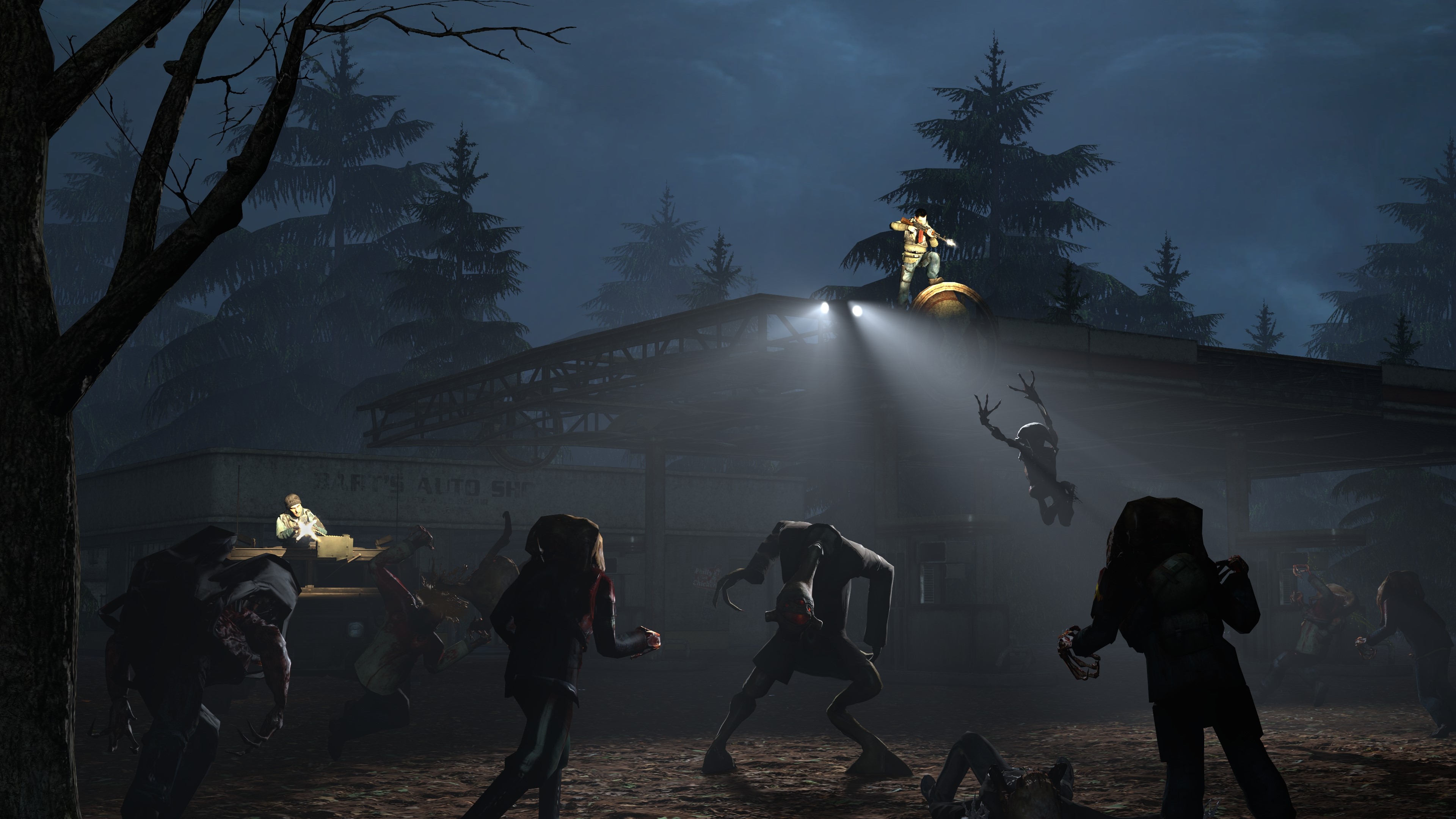
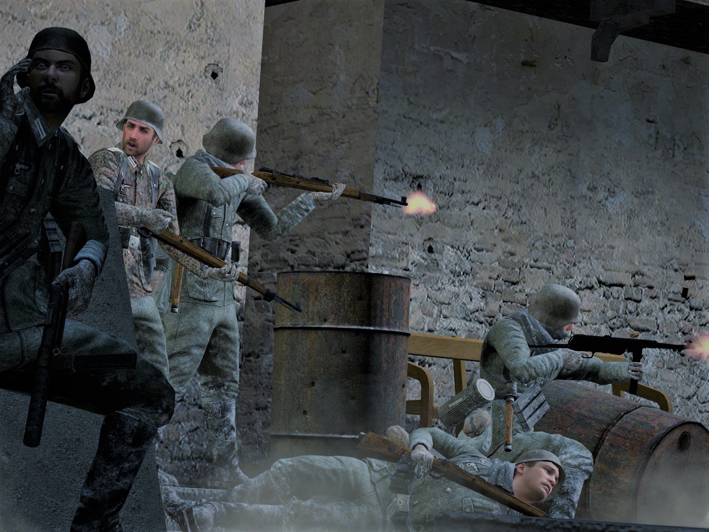
Things that are fantastic:
- Scenebuild / area.
- Background scenery.
- Posing of each individual model.
- Weapon postures.
- General scene lighting.
- Actual spotlighting.
- Muzzle flashes...1/2
Things that I think could be improved
- Maybe more floor props (I.e. grass, garbage etc).
- Muzzle flash that project light onto the area/targets and not just the person shooting
- Looks good artistically though.
This is good. This is great as a matter of fact but the only thing letting the image down is the consistency of lighting - as in, it looks very flat. And the short alleyway or corner is really a big eye sore imo. The positioning and location of each model is perfect though, and the muzzle flashes are great (but maybe increasing the saturation of the orange/brighten them up a lil?). In summary, everything is great, besides the lighting,
This is exactly what the previous picture needed, just that extra bit of
something. Love it. Whatever
it is.
Heyyyy, this is a good effect! I get it's probably for a video game or something which is why it's transparent and in the corner. But if I could offer any experience, it's better to crop these things to the size they need to be because that way when you wanna use it, you wont have to re-model/re-open/re-crop the same thing or whatever hole you gotta jump thru. If I could offer any designish tips, might be to either:
- Give text more space, since it's very enclosed.
- Or maybe even thin the font a little so it's more readable at a glance.
Very nice though friend.
Wew. This is in fact golden in terms of masking and PNG images. The mountains ✅, the tundra surface ✅, the trees in the shade ✅, the fog ✅, the sun shining onto tree tops from a specific angle that also goes through the clouds consistently??? ✅. Awesome work, really is something to be proud of imo. Nothing here I could offer that I think would make it any better.
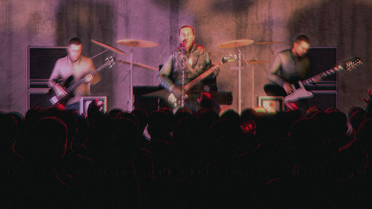
Filtered so well, and crafted in such a way that I thought this was really just hand drawn/concept art. And out of everything in the picture what I like most is the lights. The glow sticks are great, the broken ceiling lights are awesome. But I especially like that i can tell he's holding a flash light by looking at the arm, and the spotlighted area. Great work. Lav it.
A winner? I think it could be @Neythi or @Elan.
But I'd really like to highlight @Corey, compared to last weeks submission this is a big step up imo. Great work.
-
Another great week for submissions you guys, love to see all this work come out and the collection of different techniques. Keep it up. Besides, you're all winners to me.
Have a nice week you guys.
Hope my feedback was useful.
Blah blah blah.
- Danny.