RGB
Proton
- Joined
- Nov 12, 2016
- Messages
- 234
- Nebulae
- 570
What's up my dudes, I will focus mostly on drawn art, graphic art, and such things that I understand but I'll give my best go at picking out flaws from a non-technical standpoint for posed and rendered art.
This is a solid image, my only gripes could be that the characters themselves are a touch gloomy for the vivid and bright hallucinogenic trip around them. They're also just a touch stiff, but all that said you've done a good job of conveying something like cresting the hill of a psychadelic trip and dropping off the cliff into a hell of a time.
This one gave me a little pause, I knew I wanted to evaluate it when I first saw it a couple weeks ago, but I wasn't sure how. It's a simple concept, and pretty messy on the surface, but abstract in a really neat way I still struggle to explain. I like it more than I ought to. I'd have loved to have seen it on a better map because I feel the skybox is what kills this so much, and I'd like to see more of this sort of concept in the future.
Graphic design work. Very pretty, very clean, and suitable for a desktop wallpaper. My only issues being that the blacks are too soft to be just devoid of all light. The fade is too gradual and subtle to suddenly have no, for the sake of argument, what I will call stars. The little horizontal shockwave could also use a little blurring so I can't clearly see each layer of it layered on itself. Very nice though.
No? Anyway, it's unfair to judge this on the same merits as other work. A significant amount of work has gone into this and it shows. I can't begin to pick it apart, it's just gorgeous.
It's good! I like the line refraction.
The winner? Oh, well we all need to discuss that together, we'll get back to you on that.
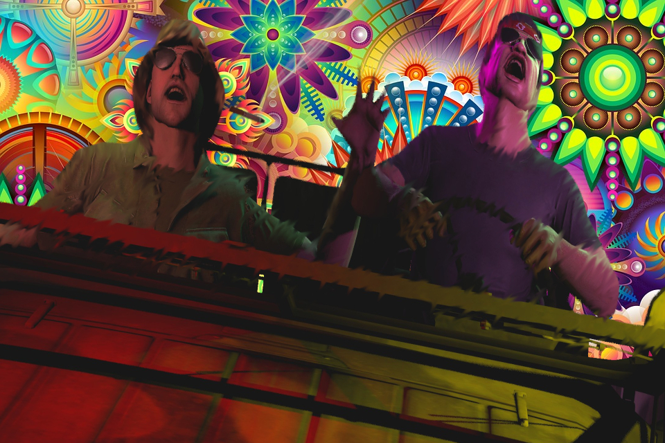
This is a solid image, my only gripes could be that the characters themselves are a touch gloomy for the vivid and bright hallucinogenic trip around them. They're also just a touch stiff, but all that said you've done a good job of conveying something like cresting the hill of a psychadelic trip and dropping off the cliff into a hell of a time.
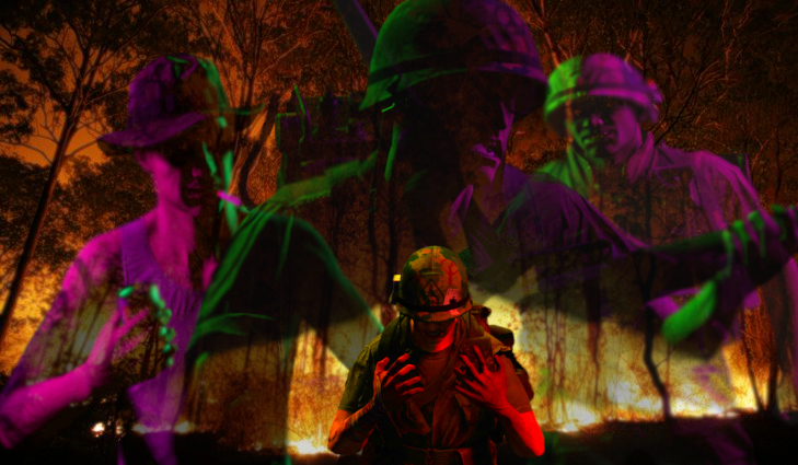
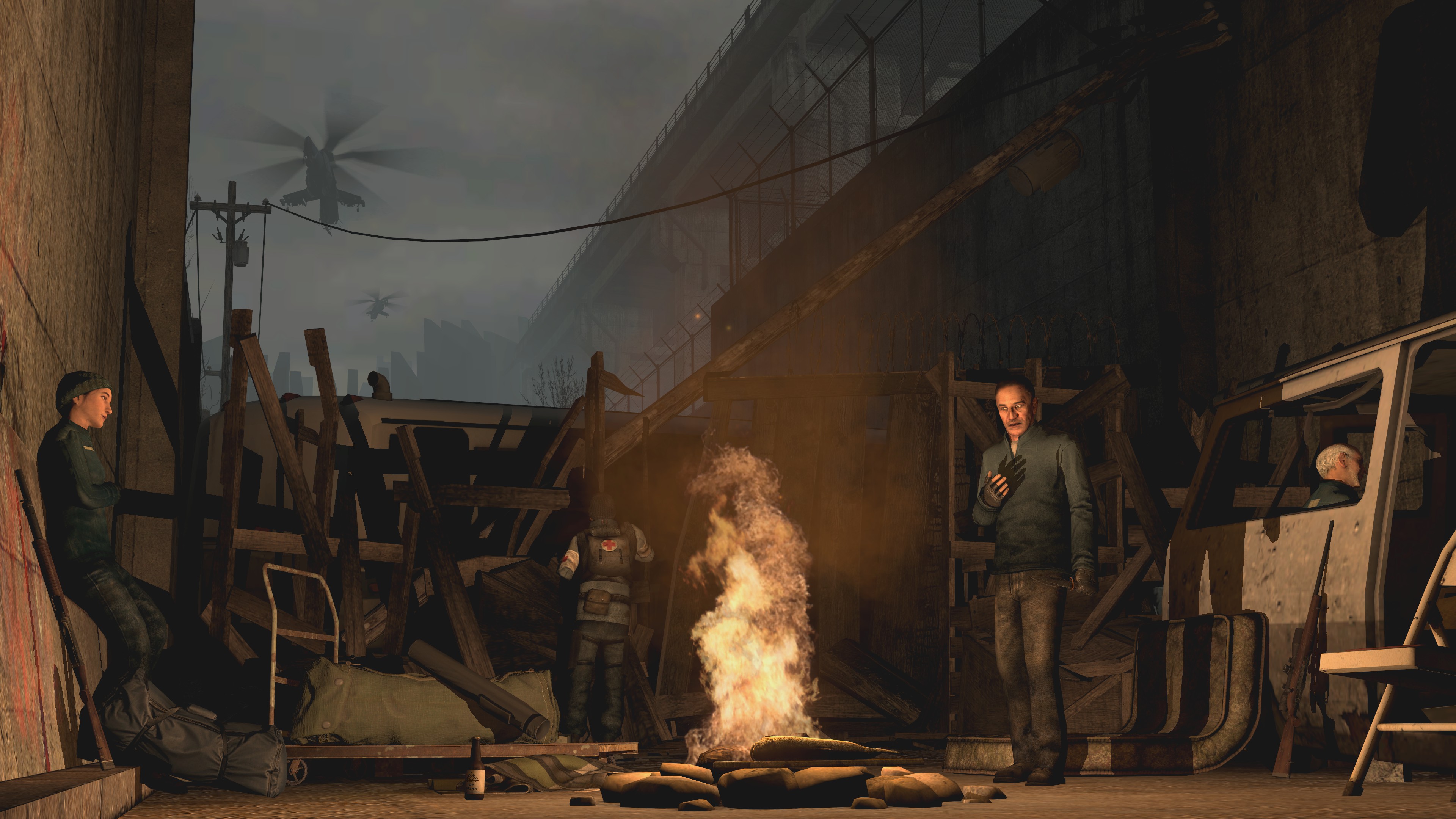
Good lighting is one of the sexiest things I can possibly think of, and this is full of it. A lovely filter that makes the air seem thick and stale with dust. The simple but trashy scenebuild, the lack of anything going on other than watching, waiting. It conveys a slice of life in a life you don't particularly want to experience at all. I can't recommend much to improve upon.oh snap a new thread. i haven't been around much but I found some new desire for sfm posing, so I made a map for sfm since most of the maps don't fit what I'm going for and made this.

i'll post how i did it on my profile latter as i do
Lovely colours, lovely pose, lovely model. Vivid and imaginative, simple. A faithful jojo reference. No more to say here.
lmao im a judge i cant even win
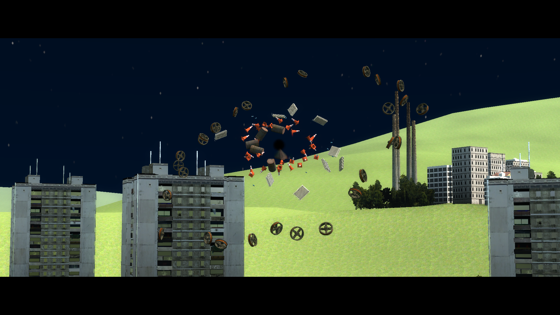
This one gave me a little pause, I knew I wanted to evaluate it when I first saw it a couple weeks ago, but I wasn't sure how. It's a simple concept, and pretty messy on the surface, but abstract in a really neat way I still struggle to explain. I like it more than I ought to. I'd have loved to have seen it on a better map because I feel the skybox is what kills this so much, and I'd like to see more of this sort of concept in the future.
Given time to evaluate my own work my main gripe is with my background. The foreground shot is fine, but the background is too unclear and rushed and in the future I should do more research into conveying what I want to before rushing something out and calling it done just because I'm tired.Here's my entry

At this point you just KNOW I'm all about that COLOUR. This is, without colour, incredibly plain and probably quite a dull piece. The colour makes it and evokes imagery of what sort of place he's moving in on to give these sorts of highlights. Bright glaring neon, perhaps? Still, it makes me interested.IDK I've just been messing around with Photoshop recently. This will be my submission until I'm done with my mega-scenebuild next week.
Lighting is our problem here, it makes for a very flat and static image with nothing to it. I suppose another issue is the smoke with an odd buffer of clear air under it.Crap like this is why I don't do scenebuilds.
A very simple image with clearly defined linework and figures. I just want to get some appreciation over here for the horse. It's so hard to draw horses. Their legs bend in funny ways and the shape of their heads is counter-intuitive. Very simple image, but very clear and enjoyable to look at. Only thing I'd really recommend is further refinement of existing shapes because the core idea is down pretty good.
He really liked that horse.
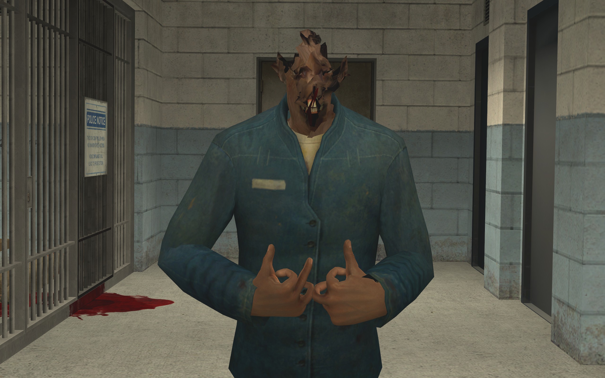
I'm usually a fan of harsh contrast in lighting but this one's a little too hard. The blacks are too black and the whites too white, it makes it more painful to look at than pleasant. Perhaps bring down the whites some, maybe obscure a little more of the face if it's so dark, or give us some directional lighting such as from above or below from a lamp to give it more atmosphere. Pose is fine, lighting needs the work.alright i gave it my best shot
its probably shit but i tried my best in the short time span i had since i got shit to do in a bit

e: also thank u max for giving me tips that i only half-followed
You run this through one of those filters? It's so harsh that it's hard to make shapes out, and while I don't wanna be over-harsh I'm just not a fan of those things, often becuase they only look artsy by blurring and obscuring lines like how chickenscratch in amateur art does the same trick. Your pose, without the filter, looks like a stock gmod pic with no post-processing work on it. Work on colours, lighting, and the fluidity of your poses before running it through the filter and I'm sure it'd look way more abstract and stylised like it should that way.I forgot how the AOTW voting system works so just take my art please

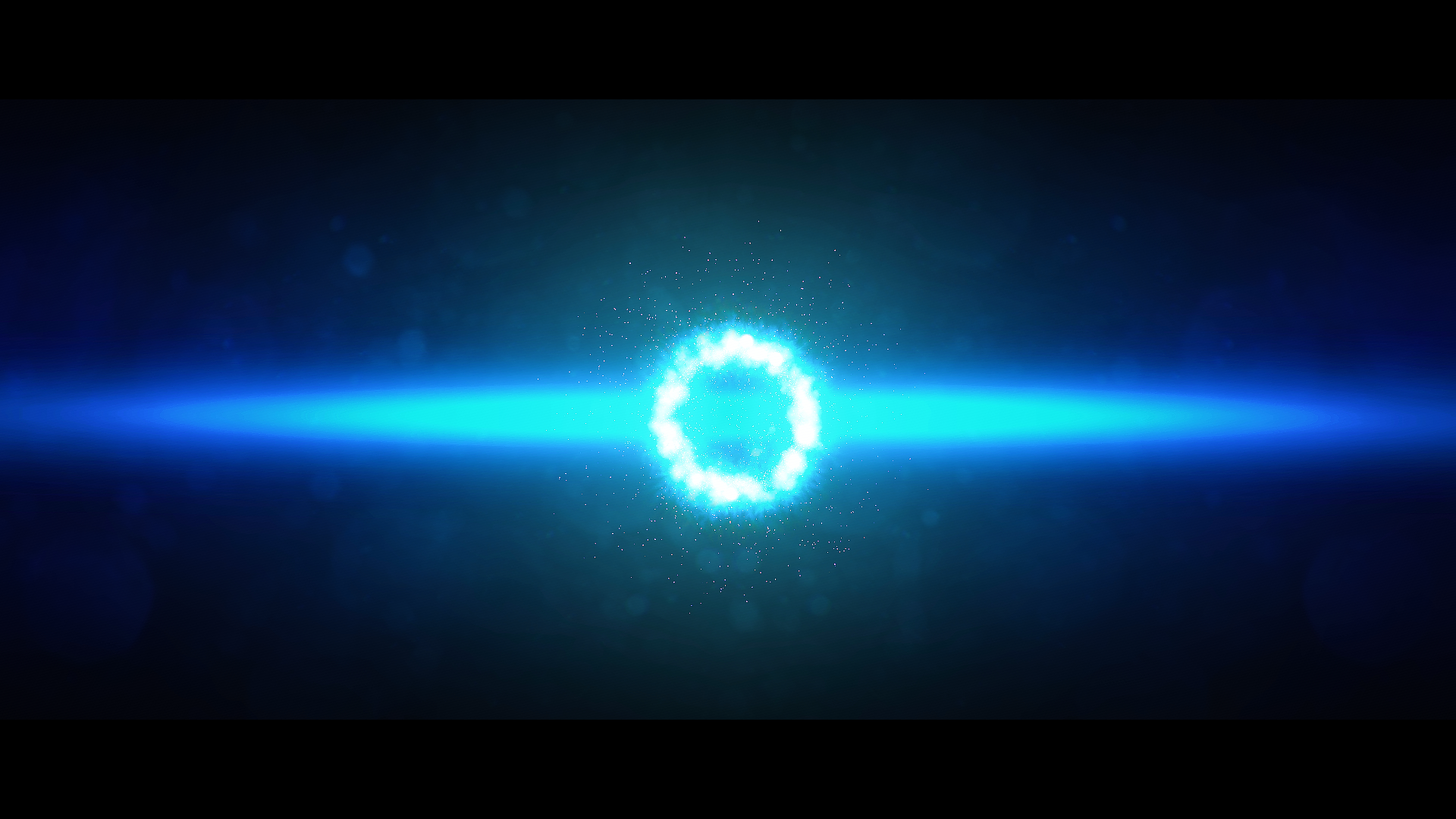

Graphic design work. Very pretty, very clean, and suitable for a desktop wallpaper. My only issues being that the blacks are too soft to be just devoid of all light. The fade is too gradual and subtle to suddenly have no, for the sake of argument, what I will call stars. The little horizontal shockwave could also use a little blurring so I can't clearly see each layer of it layered on itself. Very nice though.
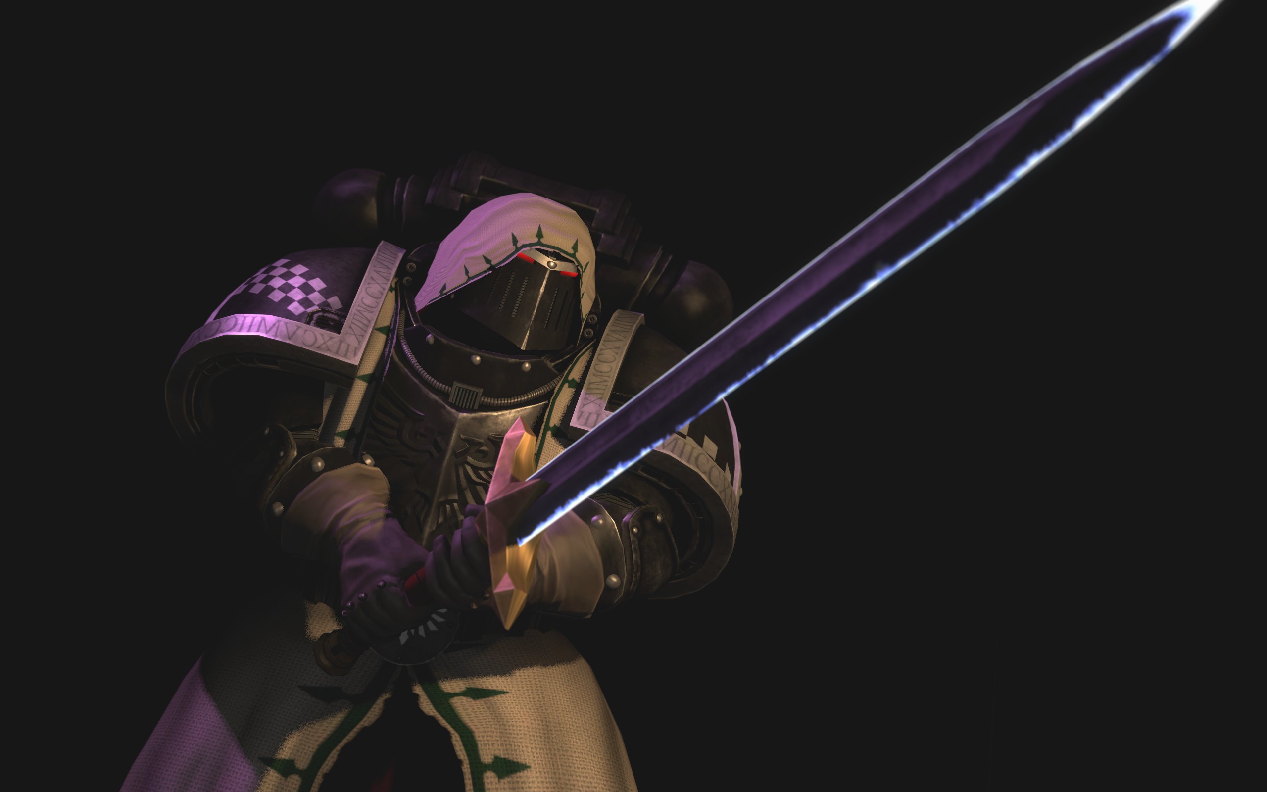
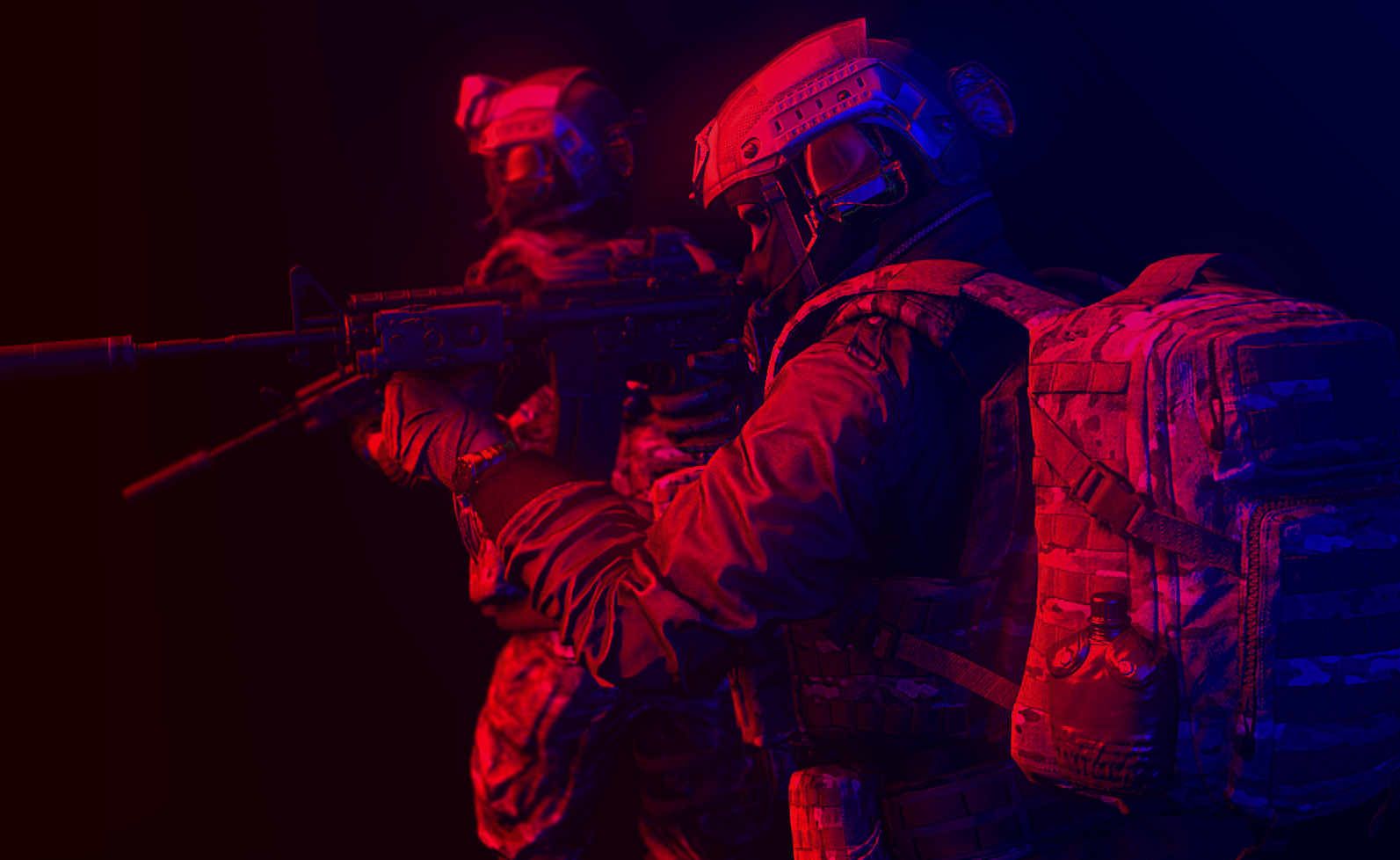
While I'm sure the Emperor is pleased I am not. No background at all, basic poses, practically no lighting. I'm repeating myself at this point as I've mentioned in several of yours previously. Interesting lighting, backgrounds, scenes, and shading is what makes a picture go from "pretty cool" to spectacular. Imagine how this would look if on a battlefield or a narrow grungy space hulk corridor.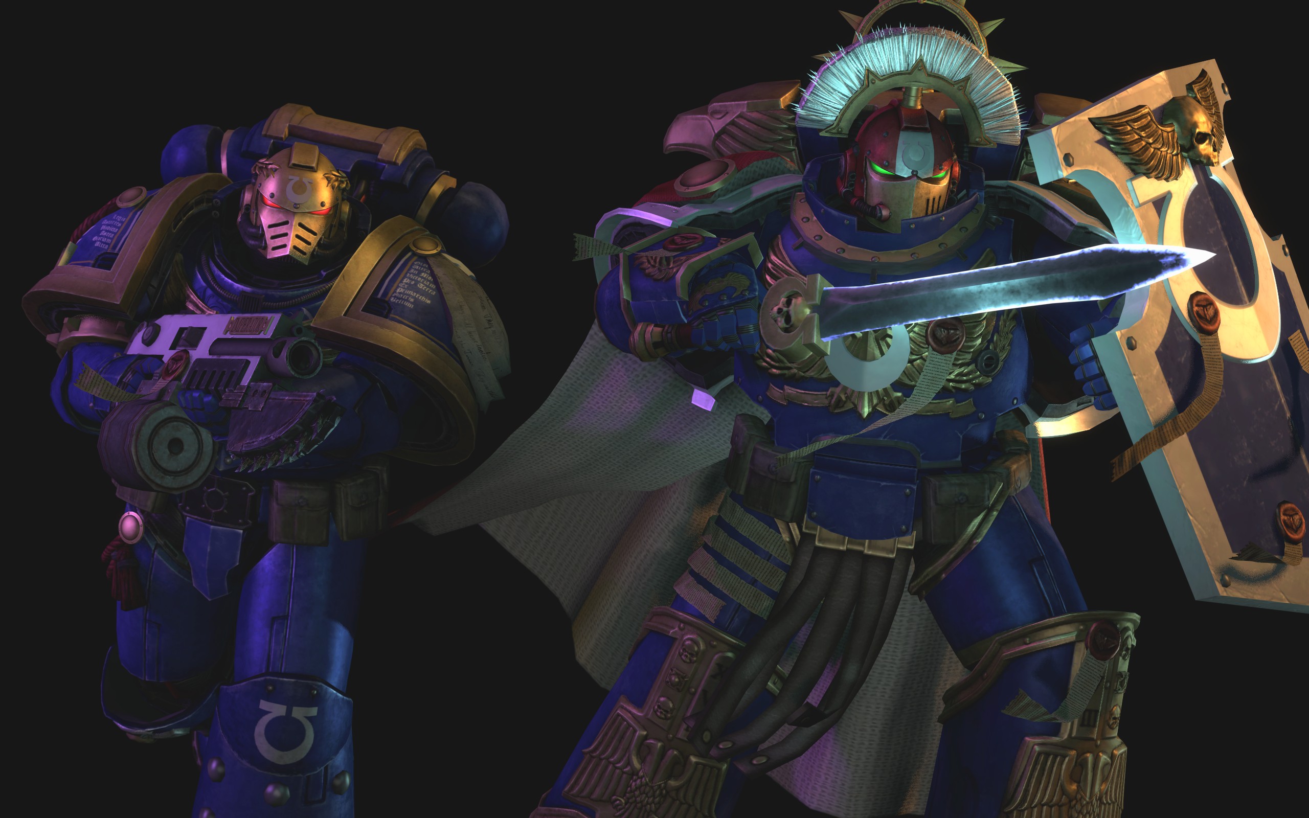
Ultrasmurfs
Anyone else fancy a game of Tokyo 42?
Finished my graphics exam. Couldn't quite do the massive map that i had planned due to the fact that it crippled my photoshop.
The spoiler contains the one im submitting for my exam however.
Overall the thing was 500-700 layers fully unmerged.
No? Anyway, it's unfair to judge this on the same merits as other work. A significant amount of work has gone into this and it shows. I can't begin to pick it apart, it's just gorgeous.
>:(Reported for bullying and hate speech.
Minimalist? Sure, I can do that too.
just testing out some shit and i like it, nothing more to it : )
minimalist boys we out here
It's good! I like the line refraction.
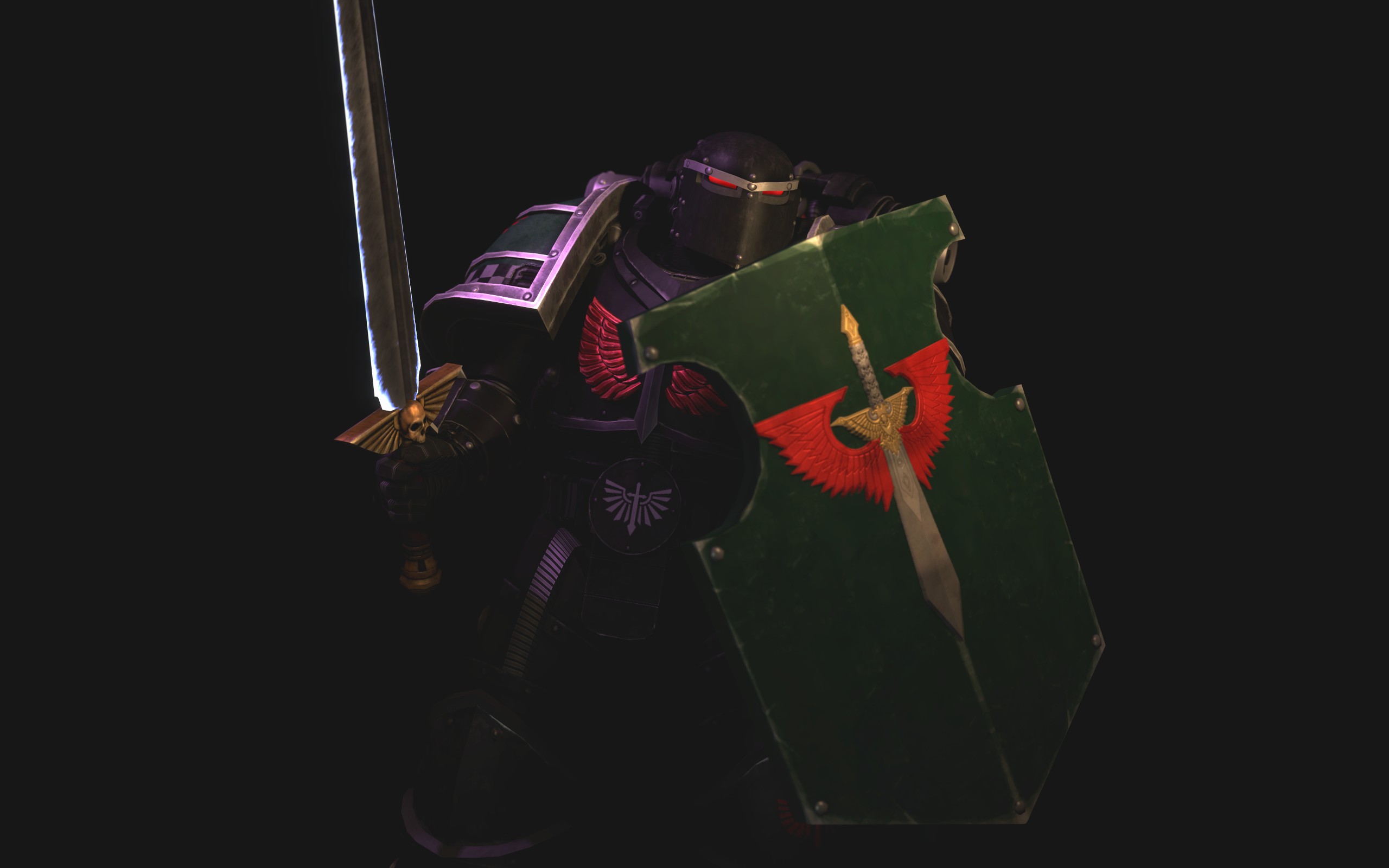
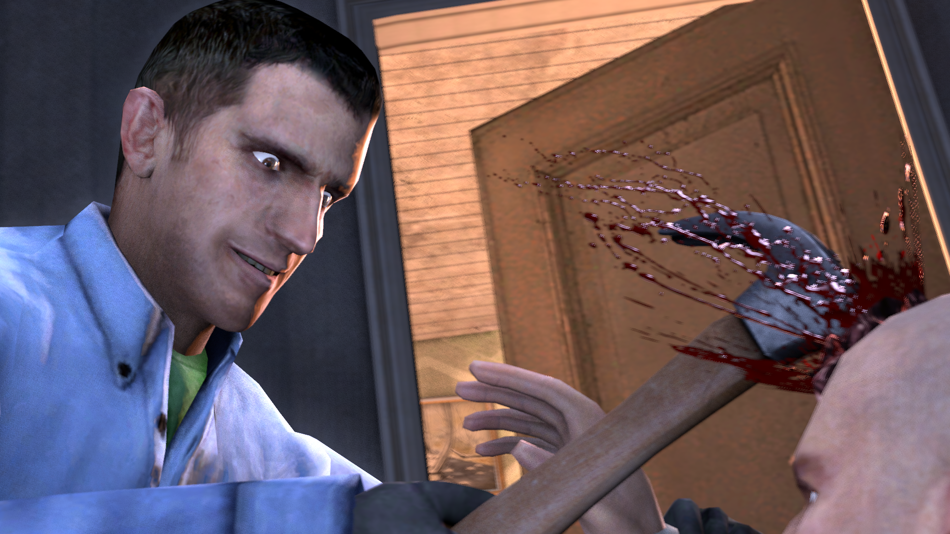
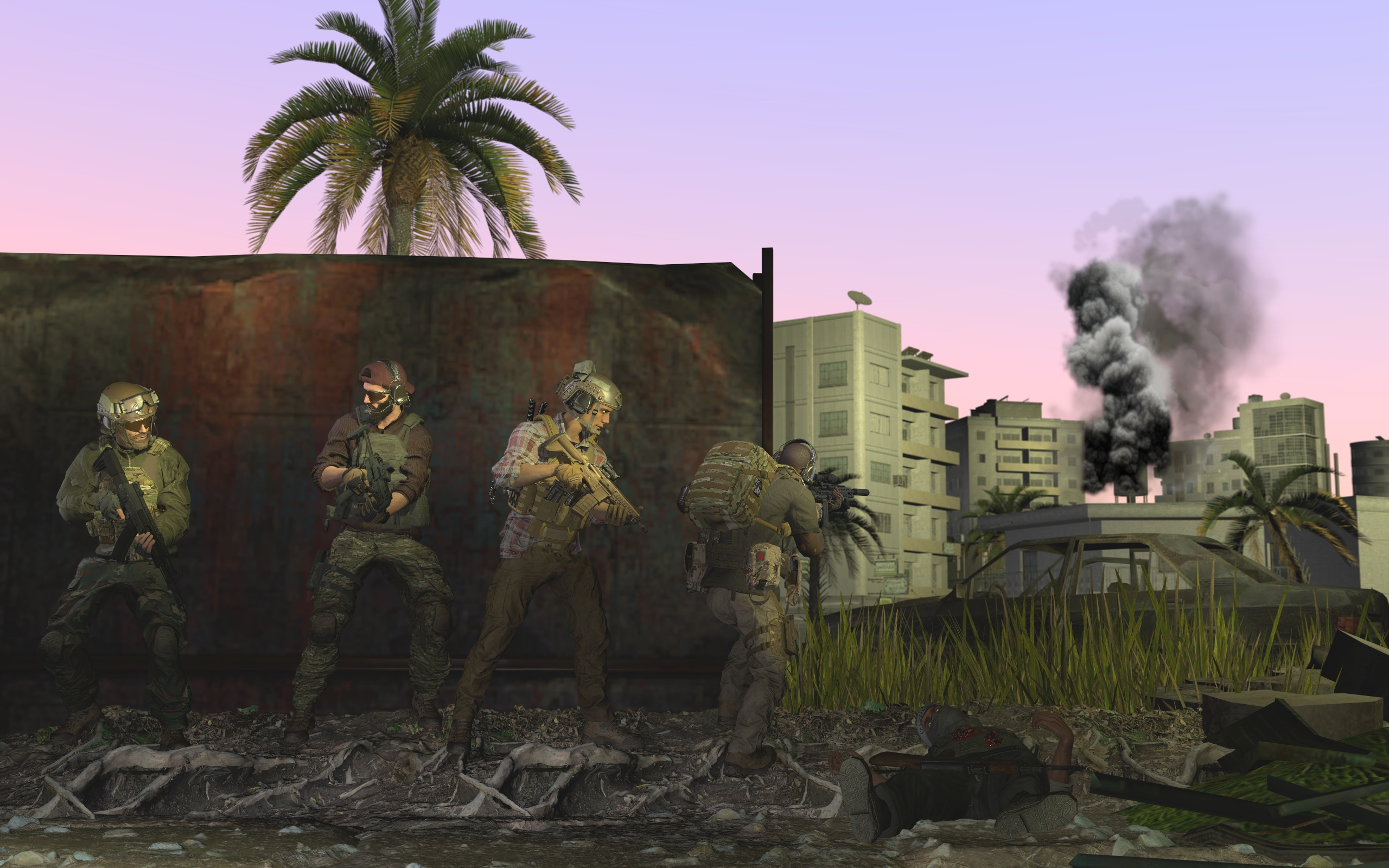
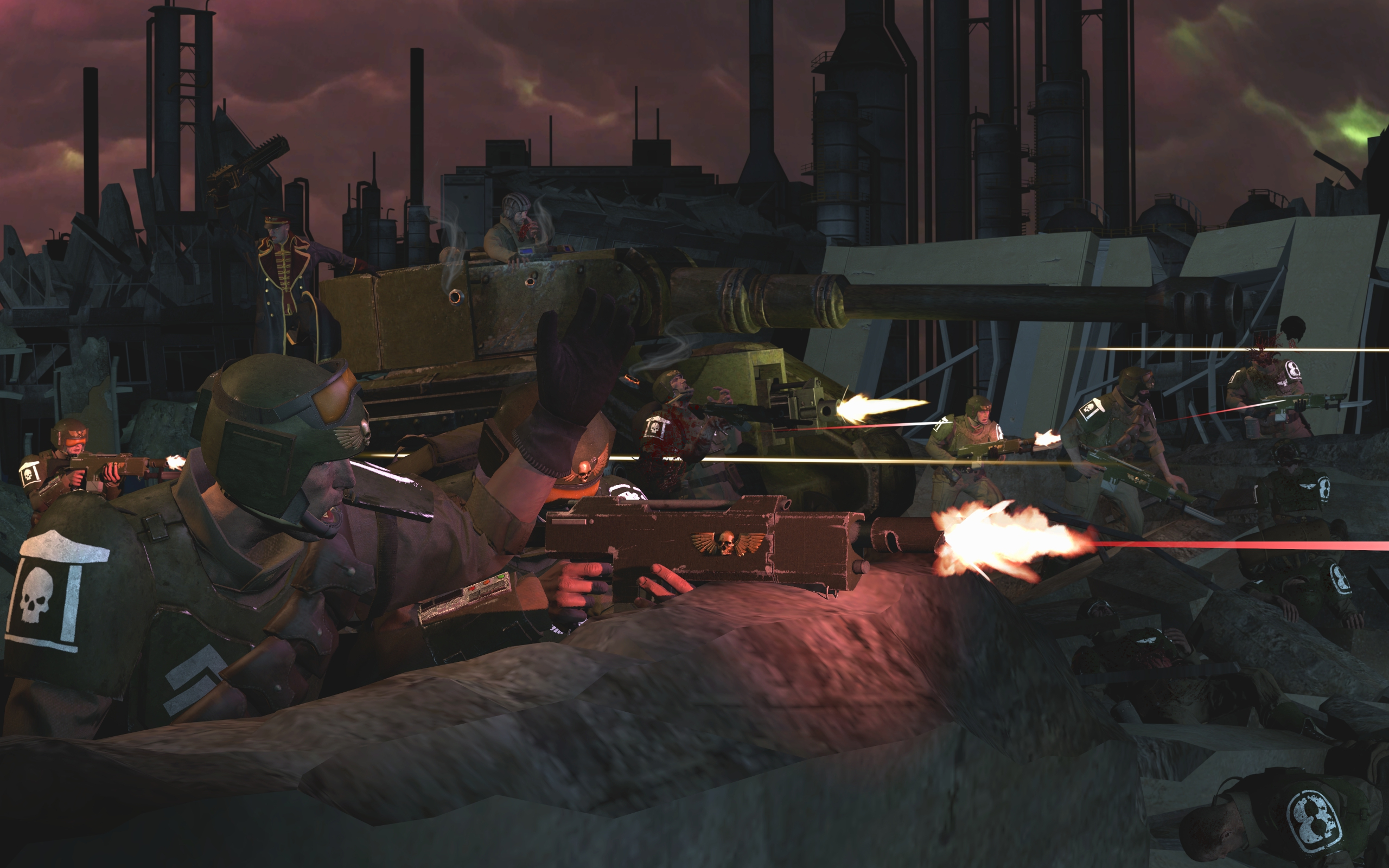
HOW MANY TIMES DO WE HAVE TO TEACH YOU THIS LESSON OLD MA- oh holy crap this one's not just good, it's great. Compared to your previous ones there's a sense of action, an amazing scenebuild, lighting at play, and a feeling of urgency with expressions and ongoing conflict. If this is progress keep it up. It only gets better.FORWARD GUARDSMEN! YOUR EMPEROR NEEDS YOU!
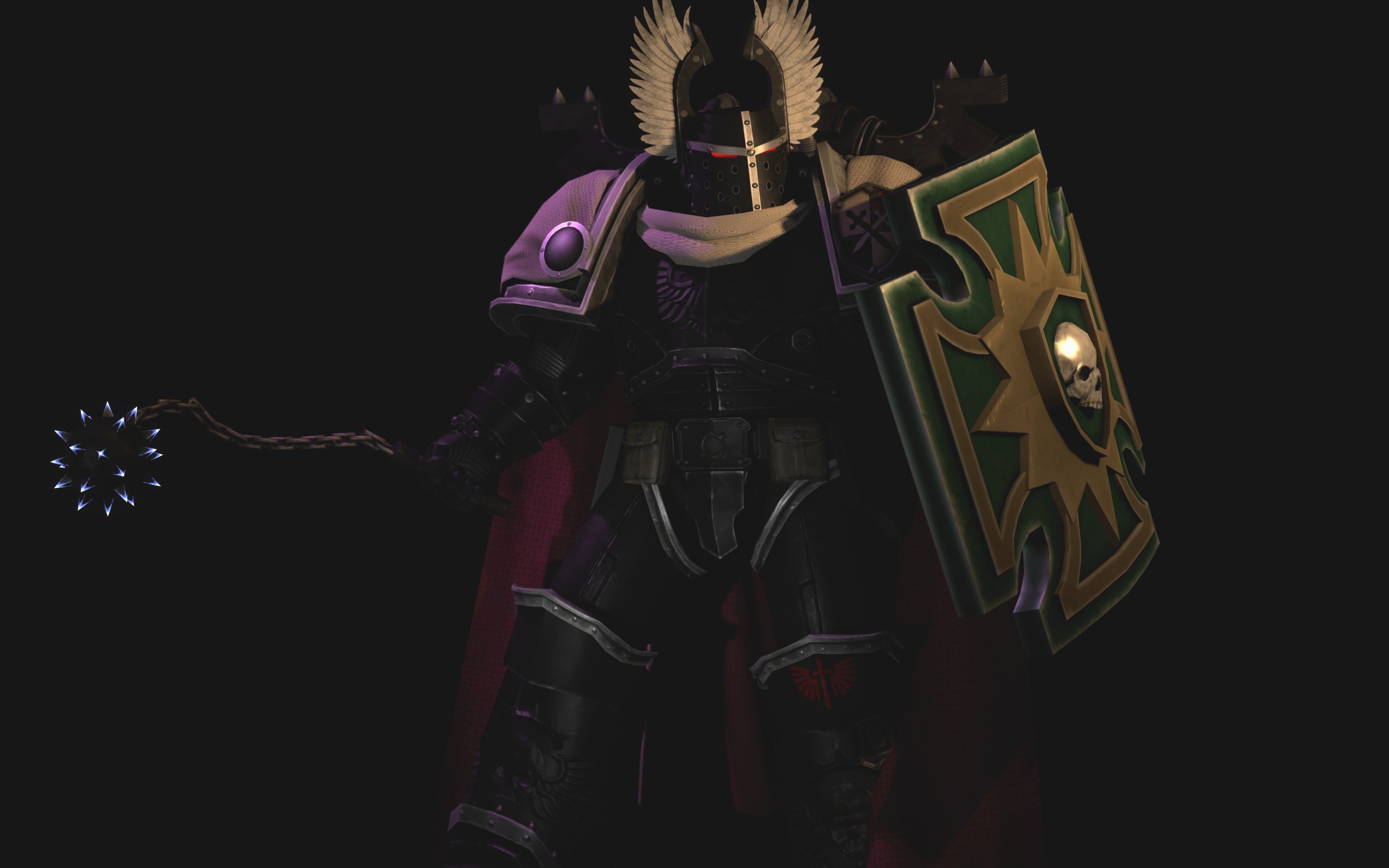
mmmmmmmmmmmmmmmmmmmmmmmyesI have a new entry for the week even though it's a re-do, so evaluate this one

Lovelylovely, lighting, slice of life, like the other one I loved by CloudBucket. This has many of the same points to raise so please see his evaluation!
The winner? Oh, well we all need to discuss that together, we'll get back to you on that.
Reactions:
List