Goonsworthy
Whatever happens, happens.
- Joined
- Oct 11, 2016
- Messages
- 2,052
- Nebulae
- 1,644

I'mma start you off with a simple phrase; it's all about the girth. The lighting you have here is basic but still really good! It's common thought that people think the pictures you make have to be in a wide angle or something, if you had made it a portrait picture such as this, way better. So yeah let that be a lesson to you all, sometimes the skinny boy resolution works just as well or better. There's more to life than 1920x1080.Sfm?


The colour consistency is so strong here and it's great! Love when there's a little thought going into how it looks in post editing. I feel as if I have seen this angle before somewhere like a movie but it's probably just a common thing to compose. Very great work, the lighting and colour system is just MWAH. Do another edgy cop pic or a rebel counterpart for this using different colours?
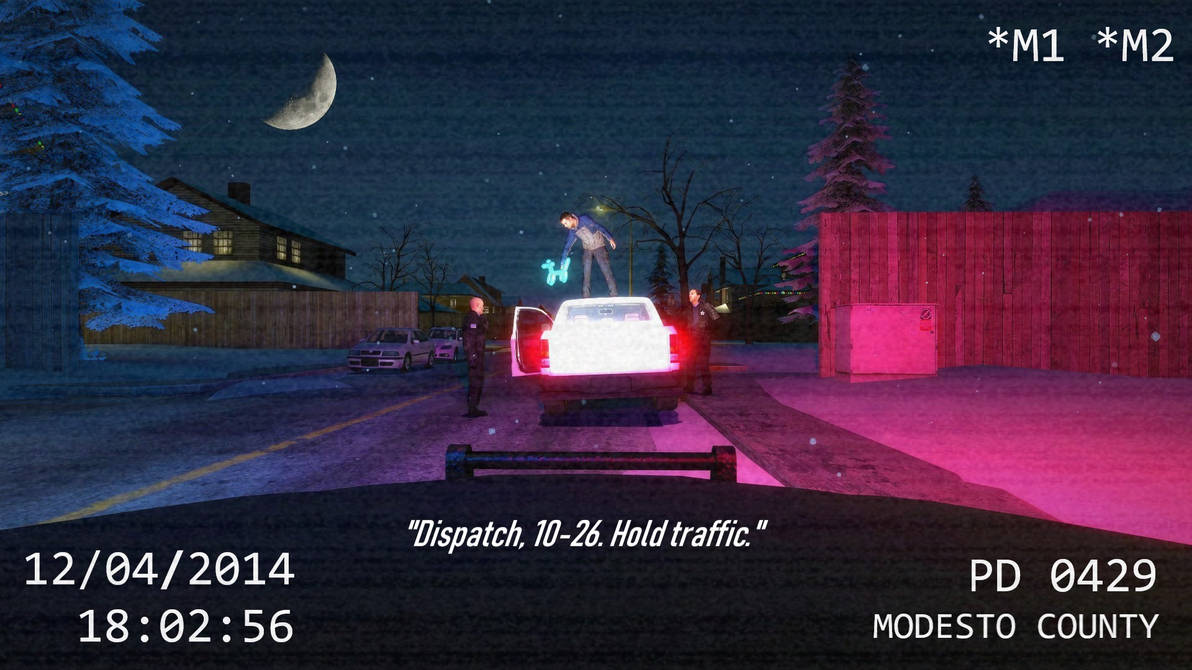
Dis is nice, like to see a wide picture from time to time but I cannae see a darn thing. I can make out the big boi on the left but y'know what I mean. I get it's nighttime but sometimes sacrifices gotta be made so people can really look at the picture - other than the lighting, this is tight as well, and the use of text matching the moon is really good as well. Keep in mind the black fade in border (also known as a vignette) is usually only used to like immerse someone in something subliminally, it forces you to look in the middle usually which is why they use it in horror games so frequently when bad stuff happens :^). Great stuff.
There is quite seriously nothing I can put against this work, really is wonderful to see adverts like this though if I were to really pick which version I prefer, would be the gifs. Wonderful stuff.
Ah, another well made example of perfect lighting. Can easily recognise everything in this picture and what they're doing almost effortlessly. My only quarrel is what I actually like about it, with how much is actually in the picture. Great post editing as well, I'd believe you if you sent this to me and said it's a promotional picture. BEST LIGHTING IN THE GAME BABYYYYY.
I'm gonna give you the same advice I gave to @Inaudible™, it's all about the resolution my guy. While this would be a nice wallpaper, if it was actually the same width as a poster it would be much better. Just gets rid of all the space people are not going to look at, as everything is in the middle. Shading work on the main guy is super good though, love how sharp it is.
Holy moly what a nice edit, actually looks kinda seamless but remember that stuff through glass can lose definition, so should've blurred it by like 1%. Only a small gripe but y'know this shit's tight. The lighting coming back into the room is amazing as well, and that book stack on the right might be the best example of black lighting I've ever seen. Marvellous.Actually I'm going to use this one as my entry for this week

I like your style, even though you're just messing around this is an idea that hasn't ever really surfaced much in the art on this forum, like cameras and first person perspectives so y'know, it's pretty good. The Subtitles add a cinematic gig to it as well which has an excellent choice of font. And the pose of all the models is pretty simple and convincing. Nice work, keep at it. And the post edit is nice as well :^)).
I have not got much to add onto this. aside from yeah, it's a nice edit. And the emphasis on the blue kinda gives it a different dimension, IF IT WERE ME THO, I woulda dimmed the lights down a bit and tried to add some rain to the windows or something. Just an idea.
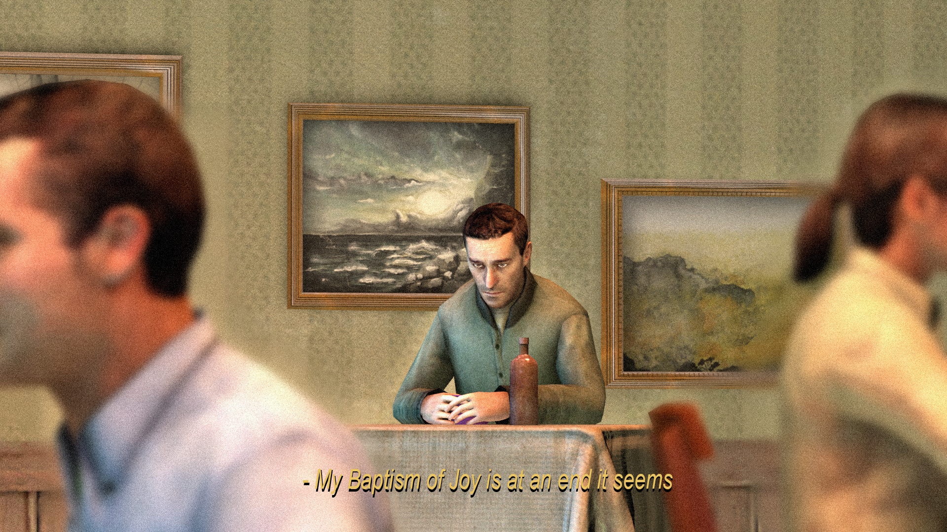
This is very nice, this actually looks ripped straight from a film but my only thing to add is the lighting, it's ok to have neutral lighting but damn there's hardly any actual shadow in this. Like even the underside of the paintings on the wall are missing some beneath but understandable if the model is just weird. It actually kind of reminds me of the film "The Lobster". Gender neutral lighting.a little something to ease me back into sfm


Would have thought there being 4 judges and a group chat where I say I cannot do it, that maybe one of them would pick it up - nah, apparently not.
:mad:
Sorry it's late, life's dealing me all the wrong cards at the moment.
This song makes me happier, hope it makes you happy too.
I'mma start you off with a simple phrase; it's all about the girth. The lighting you have here is basic but still really good! It's common thought that people think the pictures you make have to be in a wide angle or something, if you had made it a portrait picture such as this, way better. So yeah let that be a lesson to you all, sometimes the skinny boy resolution works just as well or better. There's more to life than 1920x1080.
As a closing note, it looks as if you just took this on a camera weapon on gmod, if you set up an actual camera tool I'm pretty sure there's a console command that takes a really HD pic, kinda of avoids all hose sharp shadows that bump on everything. And you're wrong, the first pic was better. Keep it up.
The colour consistency is so strong here and it's great! Love when there's a little thought going into how it looks in post editing. I feel as if I have seen this angle before somewhere like a movie but it's probably just a common thing to compose. Very great work, the lighting and colour system is just MWAH. Do another edgy cop pic or a rebel counterpart for this using different colours?
Dis is nice, like to see a wide picture from time to time but I cannae see a darn thing. I can make out the big boi on the left but y'know what I mean. I get it's nighttime but sometimes sacrifices gotta be made so people can really look at the picture - other than the lighting, this is tight as well, and the use of text matching the moon is really good as well. Keep in mind the black fade in border (also known as a vignette) is usually only used to like immerse someone in something subliminally, it forces you to look in the middle usually which is why they use it in horror games so frequently when bad stuff happens :^). Great stuff.
There is quite seriously nothing I can put against this work, really is wonderful to see adverts like this though if I were to really pick which version I prefer, would be the gifs. Wonderful stuff.
Ah, another well made example of perfect lighting. Can easily recognise everything in this picture and what they're doing almost effortlessly. My only quarrel is what I actually like about it, with how much is actually in the picture. Great post editing as well, I'd believe you if you sent this to me and said it's a promotional picture. BEST LIGHTING IN THE GAME BABYYYYY.
I'm gonna give you the same advice I gave to @Inaudible™, it's all about the resolution my guy. While this would be a nice wallpaper, if it was actually the same width as a poster it would be much better. Just gets rid of all the space people are not going to look at, as everything is in the middle. Shading work on the main guy is super good though, love how sharp it is.
Holy moly what a nice edit, actually looks kinda seamless but remember that stuff through glass can lose definition, so should've blurred it by like 1%. Only a small gripe but y'know this shit's tight. The lighting coming back into the room is amazing as well, and that book stack on the right might be the best example of black lighting I've ever seen. Marvellous.
I like your style, even though you're just messing around this is an idea that hasn't ever really surfaced much in the art on this forum, like cameras and first person perspectives so y'know, it's pretty good. The Subtitles add a cinematic gig to it as well which has an excellent choice of font. And the pose of all the models is pretty simple and convincing. Nice work, keep at it. And the post edit is nice as well :^)).
I have not got much to add onto this. aside from yeah, it's a nice edit. And the emphasis on the blue kinda gives it a different dimension, IF IT WERE ME THO, I woulda dimmed the lights down a bit and tried to add some rain to the windows or something. Just an idea.
This is very nice, this actually looks ripped straight from a film but my only thing to add is the lighting, it's ok to have neutral lighting but damn there's hardly any actual shadow in this. Like even the underside of the paintings on the wall are missing some beneath but understandable if the model is just weird. It actually kind of reminds me of the film "The Lobster". Gender neutral lighting.
MY WINNING VOTE: @247-0006-0001 'Jimbo'
Honourable Vote for "The best virtual book case lighting ever seen": @Neythi
Have a good rest of your week! hopefully doing this late wont mess up or cause a roll over, we'll just avoid it if so.
Hope my feedback was useful, talk to me if you disagree or want help with anything.
Have a good rest of your week.
Thank ya famAh, another well made example of perfect lighting. Can easily recognise everything in this picture and what they're doing almost effortlessly. My only quarrel is what I actually like about it, with how much is actually in the picture. Great post editing as well, I'd believe you if you sent this to me and said it's a promotional picture. BEST LIGHTING IN THE GAME BABYYYYY.
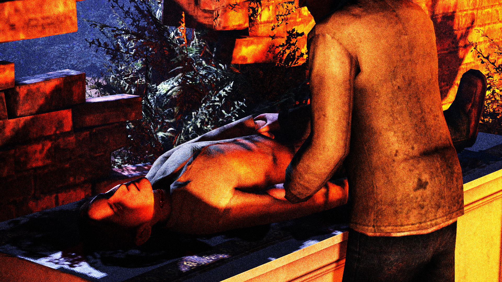
Now this is great lighting and what I'd like to see more of, simple colour palette and not much to look at which is good and bad. The only thing really missing is some props that kinda describe the scene a bit more, such as; "has this woman been kidnapped? Is she being treated for injuries?". Some simple props that can describe sinister or good motive is neccasary. When making a scene, it's almost as if making a crime scene with your own narrative if you get what I mean. Keep that in mind, great stuff though.
Ah C4D, I heard it's great and is also a curse but if you get the hang of it I expect great things for you, and the shading here is a great start and indicator. Props for giving something new and challenging a try but y'know, I think a black and white filter with some film grain over the top would up this picture a few notches. Keep it up :^).
These models are pretty cool, and the shade work is good as well but the movement of the guys head is kinda off, which is my only gripe or bad thing to say about it. Dare I say it might have looked better if he was looking to the (his)left? As I say, nit picky but you're pretty top tier now so I can only offer harsh small criticism. Maybe dabble with some depth of field as well? Since he's the only real subject in the picture.
It's bold, its creative, it's never been done before professionally, you're my hero. Still the best lighting in the game at the moment. But that font piggo, why would you do this? That damned font god damn it. Seriously nothing wrong besides the subject matter being wacky, which isn't even a downside it's just like a great example of posing ability.
Let me ruin the picture entirely for youIt's bold, its creative, it's never been done before professionally, you're my hero. Still the best lighting in the game at the moment. But that font piggo, why would you do this? That damned font god damn it. Seriously nothing wrong besides the subject matter being wacky, which isn't even a downside it's just like a great example of posing ability.


I was going to add a bloodied knife, but I am bad at photoshopNow this is great lighting and what I'd like to see more of, simple colour palette and not much to look at which is good and bad. The only thing really missing is some props that kinda describe the scene a bit more, such as; "has this woman been kidnapped? Is she being treated for injuries?". Some simple props that can describe sinister or good motive is neccasary. When making a scene, it's almost as if making a crime scene with your own narrative if you get what I mean. Keep that in mind, great stuff though.